[The project referred to in this post can be found at http://vestigial.org/MMT/ ]
I’ve been looking for some better tools to produce interactive, data driven, visually appealing web content. In the past couple of years, I’ve become enamored with R for analysis and visualization, but the graphic results are static. (Sure, there are tricks to create animations, but I’m not looking for workarounds.) I occasionally use Google Charts when I need to put together a quick visualization, but they don’t provide quite the level of flexibility I’d like. I started looking at either working directly with SVG or Canvas DOM elements, or using a Javascript SVG library that would allow me to avoid the low-level details.
The most interesting possibility was the D3 framework. D3 — for Data-Driven Documents — is an entire framework for DOM manipulation in data-driven sites. Browsing through the examples on the D3 site, I recognized several memorable visualizations that have appeared on one of my favorite blogs through the years, Flowing Data. It is possible to use D3 for SVG construction and manipulation while non-data-driven portions of the site are handled by, eg, jQuery or standard Javascript. But as long as you’re already using the bandwidth to load the framework, you might as well drop other frameworks, and use the tools that D3 provides.
I was keen to get some experience with D3. When learning a new technology, I prefer to dive straight in — come up with a short, but non-trivial project that I can build. In this case, I came up with a project that melds technology, data visualization, and ultrarunning. The Massanutten Mountain 100 Mile Trail Run (or MMT) is in a few weeks. In such a long race, runners and crews like to have some idea when they’ll arrive at intermediate points along the course if they’re aiming for some given finish time. Conversely, knowing when they’ve arrived at points along the course can help to predict what sort of finish time to expect. While I’m not the first person to provide a visualization, or some tool to correlate aid station splits with finish times, it’s fun to put together something that’s visually appealing and useful.
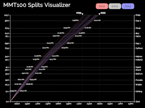
Showing data from 2011 and 2013 for finishers who finished between 20:59 and 25:55, race time. The horizontal axis is time and the vertical axis is distance, labeled on the left with mileage at each aid station, and on the right with the aid station name. Each diagonal line, or “track”, represents a single racer. Intermediate times on the graph show first and last racer times of arrival at each aid station (for racers in the result set). Tufte would be proud.
There are several interactive components that I think are noteworthy. First, I provide on-demand data loading. When the page loads, none of the race results is loaded. When a year is selected, the page checks whether the data have been downloaded. If not, it fires an AJAX request, and saves the data so the results can be turned on and off.
The page also provides sliders to limit the result set based on finish time. Each limiter consists of three components: a triangular slider widget (represented by an SVG path element), a time display (represented by an SVG text element), and a vertical guide line (represented by an SVG line element). When the widget is slid, all three elements should move in unison, and the time display should update with the time value at the current point. As a bonus, the vertical guide gets brighter. So I needed to be able to address each element individually, but move them in unison. To build that, first I needed to define the shape for my widget (note that in SVG coordinates, the top left is [0,0]):
var limpolygon = [{x: 0, y: 0}, {x: 10, y: 0}, {x: 5, y: 10}, {x: 0, y: 0}];
I also need to define a function to tell D3 how to interpret the data above. I can use d3.svg.line() to return a function for this purpose. Since I’ve built the object with straight-forward X and Y coordinates, I just need to build a simple function based on those values:
var limline = d3.svg.line()
  .interpolate("linear")
  .x(function(d) { return d.x; })
  .y(function(d) { return d.y; });
Finally, I put the group together. I define a group element (“g”), and append the widget, which I construct in place. I then use the D3 selector to reselect the group, and add the line, then the text:
svg.append("g")  // Create the group, append it to the svg object
  .attr("id", "lim1")
  .attr("transform", "translate("+lim1x+","+limy+")")  // Put it into position
  .append("path")  // Create "path" element for widget, and append it to group
    .attr("id", "lim1_point")
    .attr("d", limline(limpolygon))  // A path has a "d" attribute which gives
                                     // instructions for drawing. Our limline()
                                     // translates raw data into path data
    .attr("fill", "white")
    .on("mousedown", function() {
      capt = "lim1";
      d3.select("#lim1_line").style("stroke-opacity", "1");
    });

d3.select("#lim1").append("svg:line")   // Create line element, append to group
  .attr("x1", limhalfw)
  .attr("y1", ex_pad.top)
  .attr("x2", limhalfw)
  .attr("y2", height - ex_pad.bottom)
  .attr("id", "lim1_line");

d3.select("#lim1").append("svg:text")   // Create text element, append to group
  .attr("id", "lim1_time")
  .text("00:00")
  .style("text-anchor", "end")
  .attr("transform", "translate(-2)");  // Push it 2px to left, for a nice gap
In my view, the coolest trick is making the data respond to the sliders. Whereas showing or hiding the individual years relies on a small number (3) of discrete values, I need to show or hide individual race results based on what is essentially a continuous scale. This involves several steps. First, when adding each track to the graph, I need to attach the finish time to it. Fortunately, HTML5 provides the ability to specify arbitrary data attributes with the data-* construct.
lineset.enter()
  .append("path")
  .attr("data-finish", function(d) {  // Add the data-finish attribute
    return d.finish;
   })
  .style("stroke-opacity", function(d) {
    if (d.finish > finScale(lim2x) || d.finish < finScale(lim1x)) return "0";
    else return ".3";
   })
  .datum(function(d) { return d.splits; })
  .attr("class", "rtrack line " + iden)  // Classes to use later in selectors
  .attr("d", line);
Above is the code to add the tracks. While it might not make much sense if you are not familiar with D3, the key point is the third line. The object has a data object, d, applied to it, and on that line, we set the data-finish attribute to the value of d.finish. (Directly below that, we set the opacity of the line to 0 (making it invisible) if it falls outside of our specified range, or .3 if it is inside the range. But we’re getting ahead of ourselves.)
The next thing we need to a way to translate the location of a slider into a finish time. D3 provides “scales” for just such a purpose. Usually, D3 scales are used to translate some real world value to a pixel position. In this case, we want to do the reverse. I want to build a function that will translate an input domain of a pixel position into the output range of a race time, which in this case is between 0 and 36 hours.
var finScale = d3.scale.linear()
  .domain([lim1x, lim2x])
  .range([0, 36]);
(An astute reader who is familiar with D3 might note that somewhere else, I must have defined a scale to translate from times to pixel values. In that case, someone might wonder why I don’t just use linear.invert() to translate a range value into its corresponding domain value. The answer is that the scale that translates from time to position uses a domain defined by the time of day as a date object, whereas in this case, I want to translate between position and a floating point number representing the finish time in hours (with minutes represented in the fractional portion of the number). Hence the need to define a new scale.)
In this case, lim1x is the initial pixel position of the lower limit slider, and lim2x is the pixel position of the upper limit slider. That produces a function that can be called as finScale(px_pos) to return a corresponding race time. I can then use that in the function that is called when a slider is released.
function updateRange() {
  var fin1 = finScale(lim1x);  // Translate pixel positions to finish times
  var fin2 = finScale(lim2x);
  d3.selectAll(".rtrack").transition(500).style("stroke-opacity", function(d) {
    if (this.getAttribute("data-finish") > fin2 ||
        this.getAttribute("data-finish") < fin1) return "0";
    else return ".3";
  });

  updateAidStationTimes();
}
That function translates the current pixel positions of the sliders into race times (fin1 and fin2). Then it uses d3.selectAll to get every item with the class “rtrack” (which is every race line displayed on the graph), applies a 500ms transition time to the following step, then sets the stroke-opacity style based on a function that checks whether the custom attribute data-finish is in the range defined by the limiters. Finally, it calls updateAidStationTimes(), which I won’t explain in detail here, but it uses d3.extent() with a custom accessor function to find the first and last arrival time of racers in the result set at each aid station. (If you’re particularly interested, you can always dig it out of the source.) It then updates the times displayed on the graph, and moves them into the proper positions.
I started the project on Saturday morning with no experience in D3 (or with SVG graphics), and I finished Sunday evening. I even had time to get out for a bike ride, a run, and a trip to the library to get a movie (which I also watched over the weekend). In the course of this project, I came to appreciate just how massive D3 is. I’m starting to get a feel for it, but this project just scratched the tip of the D3 iceberg (though I’m not sure one would really scratch an iceberg, the tip or otherwise).
[The project referred to in this post can be found at http://vestigial.org/MMT/ ]