Tag Archives: running

programming

The Obsessing Over The Splits

“There’s one more piece,” I explained to Martha, “that you have to master.” The previous fall, she had developed a fibroma in her foot that curtailed her running. Hoping to keep her active (ie, non-grumpy), I dragged her to the pool. She never claimed to enjoy swimming, but on Monday and Wednesday nights, she would make sure I was planning on swimming the following morning. Even if she felt like it was a constant struggle, in a few months, she had improved significantly (ie, not nearly as much gasping and clinging to the side of the pool as when she started).

In the spring, she surprised me with her keenness to spend time on a bike. At first, it was mountain biking in West Virginia. Then she got a BikeShare membership so we could ride in Rock Creek Park on the weekends, when they close Beach Drive to traffic. Then she started talking about getting her own bike. After years of referring to bikes as, “The Vehicle Of Death,” I wasn’t sure what to make of it. But I was happy to go along with it. Eventually, I casually mentioned that, what, with all the swimming and biking, she might as well sign up for a triathlon. And much to my surprise, she was game!

I hadn’t raced a tri since 2008, so I was looking forward to a return to the sport. I picked Luray Triathlon (international distance — 1500 meter lake swim, 40km bike, 10km run) in August as a target race, and we got about to training. Well, there really wasn’t so much “training” in a specific sense. I mean, we’d go to the pool once or twice a week, we’d do 40-50 mile bike rides (far longer and hillier than the bike portion of the race) pretty regularly, and running is our bread and butter.

Long story short, she had a great race, despite coming out of the water pretty close to the tail end of the field. She tells the full story on her blog, so I won’t restate it all. But after the race, there was one last lesson of triathlon that she needed to learn — one more piece to master.

“Part of the triathlon experience is obsessing over the results.” In a running race, you might have intermediate splits, but after looking at the results, all you can really say is, “I gotta run faster.” Or maybe, “Look at that positive split! I gotta not race like a friggin’ moron!” But in triathlon, you get your finish time, but also times for the swim, bike, run, and two transitions. So you can say things like, “My swim, bike, and run were awful, and my first transition was slow as dirt… But I ROCKED my second transition!” Yes, obsessing over results, and imagining how much more awesome you would be if you could only swim faster is a grand part of the triathlon tradition.

Looking at Martha’s splits, it’s clear that she’s a weak swimmer (4th percentile of the race), a fair cyclist, and a standout runner (10th overall, including elite men). This seems like a time for some visualizations! The first step was to put the results into a CSV file, and load it into R. I wrote a little function to convert the times to total second, so everything could be compared numerically.

getTime <- function(time) {
  sec <- 0
  if ('' != time) {
    t <- as.integer(strsplit(as.character(time), ':')[[1]])
    sec <- t[1]
    for (i in 2:length(t)) {
      sec <- sec * 60 + t[i]
    }
  }
  sec
}

And I used that in a function that compiles the splits in to a vector.

getSplits <- function(results) {
  splits <- c()
  for (i in 1:length(results$TotalTime)) {
    swim <- getTime(results$Swim[i])
    t1 <- getTime(results$T1[i])
    bike <- getTime(results$Bike[i])
    t2 <- getTime(results$T2[i])
    run <- getTime(results$Run[i])
    penalty <- getTime(results$Penalty[i])
    total <- getTime(results$TotalTime[i])

    if (0 == t1) t1 <- 180 # Default of 3m if missing T1
    if (0 == t2) t2 <- 120 # Default of 2m if missing T2

    # If missing a split, figure it out from total time
    known <- swim + t1 + bike + t2 + run
    if (0 == swim) swim <- total - known
    else if (0 == bike) bike <- total - known
    else if (0 == run) run <- total - known
    
    if (swim & run & bike) { # Exclude results missing two splits
      splits <- c(splits, swim, t1, bike, t2, run, penalty)
    }
  }
  splits
}

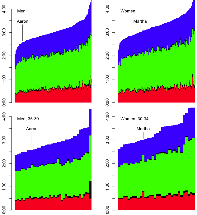
From there, I could produce a graph showing color-coded splits in the order of finish for the race.

splits <- getSplits(results)

barplot(matrix(splits, nrow=6), border=NA, space=0, axes=FALSE,
        col=c('red', 'black', 'green', 'black', 'blue', 'black'))

# Draw the Y-axis
axis.at <- seq(0, 14400, 1800)
axis.labels <- c('0:00', '0:30', '1:00', '1:30', '2:00',
                 '2:30', '3:00', '3:30', '4:00')
axis(2, at=axis.at, labels=axis.labels)

Luray Intl. Distance Tri, Overall

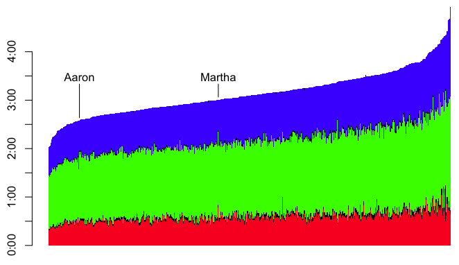
Each vertical, multi-colored bar represents a racer. The red is the swim split, green is the bike, and blue is the run (with black in between for transitions, and at the end for penalties). It becomes clear from this graph that Martha was one of the last people out of the water (notice her tall red bar), then had a fair bike ride, but didn’t make up much time there. It wasn’t until the run that she started to make up time. That’s what moved her from the tail end of the field to the top half.

But part of the beauty of obsessing over triathlon results is that there are so many ways to slice and dice the data. It seems only fair that we should look at the sex-segregated results, and of course, triathletes are very into age group results. So we can limit the sets of data to our individual sexes and age groups.

Luray Results

So that’s one way to look at the data. However, that only provided a fuzzy notion of how each of us did in the three sports. For example, my swim time is similar to the swim times of many people who finished with similar overall times. It’s difficult to tell where I stand relative to the entire field.

Perhaps a histogram is more appropriate. For example, I could use my getTime function to create a list of the finish times for everyone.

times <- sapply(results$TotalTime, getTime)

Then it’s trivial to draw a histogram of finish times.

hist(times, axes=FALSE, ylab='Frequency of Finishers', xlab='Finish Time',
     breaks=20, col='black', border='white', main='Histogram of Finishers')

To draw the X-axis, I created a function that translates a number of seconds to a time string with the H:MM format.

# Make a function to print the time as H:MM
formatTime <- function(sec) {
  paste(as.integer(sec / 3600),  # Hours
        sprintf('%02d', as.integer((sec %% 3600) / 60)), # Minutes
        sep=':')
}

# Specify where the tick marks should be drawn, and how
# they should be labeled
axis.at <- seq(min(times), max(times),
               as.integer((max(times) - min(times)) / 10))
axis.labels <- sapply(axis.at, formatTime)

# Draw the X-axis
axis(1, at=axis.at, labels=axis.labels)

That gives me this:

Luray 2014 International Distance Results, Histogram
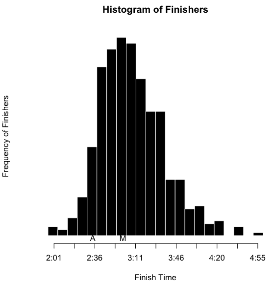
I’ve also inserted an ‘A’ below the results to notate where I finished, and an ‘M’ to notate where Martha finished. However, as I’ve indicated, part of the obsessing over the splits involves slicing the data as many ways as possible. I wanted to see this sort of histogram for each of the sports overall, by sex, and by age group. That’s a nine-way breakdown, for both me and Martha. Fortunately, since the data is all in R, and since I have the code all ready, it’s fairly trivial to make the histograms. They need to be viewed a bit larger than the width of this column, so you can click on the images below to see more detail. Here’s mine:

Luray Histogram, Aaron
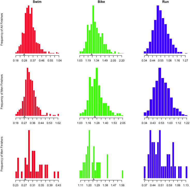
Looking at my results, it is clear that I’m a stronger swimmer than cyclist, but it’s really the run that saves my race. Here’s Martha’s:

Luray Histogram, Martha

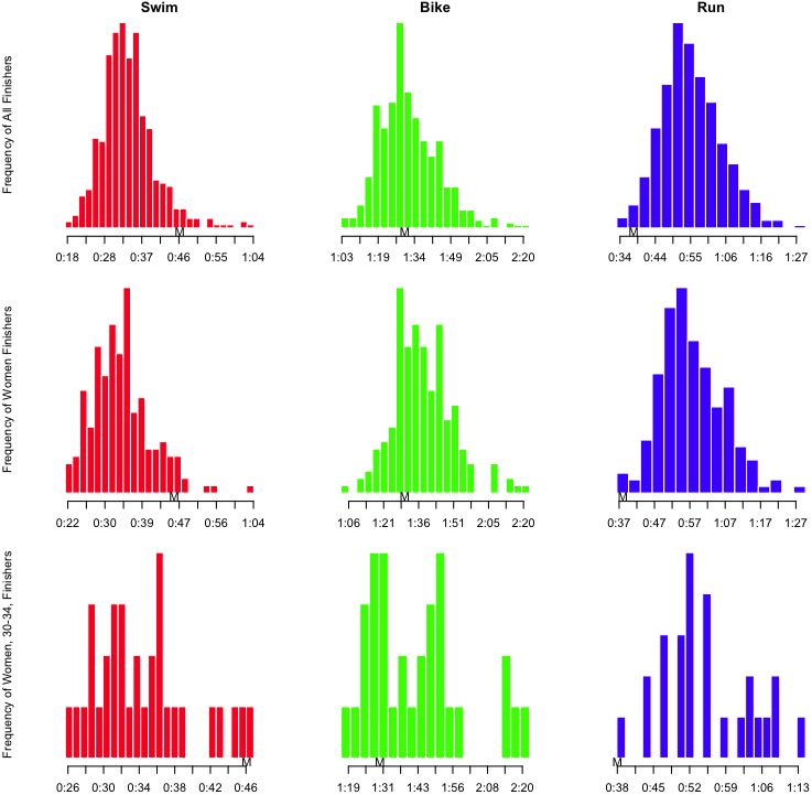
Notice that in her age group, she had the slowest swim, and the fastest run. She clearly gets stronger as the race goes on.

But there is still (at least) one more way to look at the results. Not only do we want to know how we perform in each of the disciplines; we also want to know how we progress through the race. That is, how do our positions change from the swim to the bike to the run to the finish? I started off with a function similar to “getSplits” above. I called this totalSplits. For a given racer, this produced a vector of the cumulative time after six points in the race: swim, t1, bike, t2, run, penalties. I could use those vectors to build a matrix, which I could then use to build a graph of how race positions changed from the swim to the bike to the finish.

all.totals <- t(matrix(apply(results, 1, totalSplits), nrow=6))
# Exclude results that are incomplete
all.totals <- all.totals[which(all.totals[,6] != 0),]
cnt <- length(all.totals[,1])

# Map the swim, bike, and finish times onto a range of 0 to 1, with
# 1 being the fastest, and 0 being the slowest.
doScale <- function(points) {
  1 - ((points - min(points)) / (max(points) - min(points)))
}
scaled.swim <- doScale(all.totals[,1])
scaled.bike <- doScale(all.totals[,3])
scaled.finish <- doScale(all.totals[,6])

# Plot points for swim, bike and finish places
plot(c(rep(1, cnt), rep(2, cnt), rep(3, cnt)),
     c(scaled.swim, scaled.bike, scaled.finish),
     pch='.', axes=FALSE, xlab='', ylab='',
     col=c(rep('red', cnt), rep('green', cnt), rep('blue', cnt)))

# Add the lines that correspond to individual racers
for (i in 1:cnt) {
  lines(c(1,2,3),
        c(scaled.swim[i], scaled.bike[i], scaled.finish[i]),
        col='#00000022')
}

# Add some axes
axis(1, at=c(1, 2, 3), labels=c('Swim', 'Bike', 'Finish'))
axis(2, at=c(0, 1), labels=c('Last', 'First'))

From that, I get something that looks like this:

Luray Results, Places

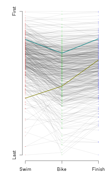
It looks like a crumpled piece of paper, so perhaps it needs some explanation. At the left is the placing for racers after the swim from the fastest swimmer at the top, to the slowest at the bottom. In the middle is the placing after the bike, and on the left is the placing at the finish. The first thing I notice is that there seems to be little correlation between placing after the swim and after the bike. The left side of the graph looks like a jumbled mess. The other thing I notice is that the top racers — note that prize money brought some pros to this race — are fantastic all-around. To pick out my results and Martha’s results, I highlighted them in aqua and yellow, respectively.

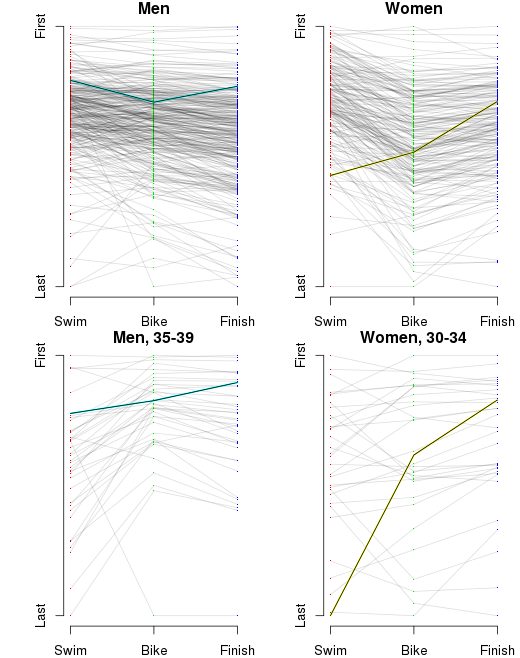
And for the sake of completeness, we need to break that down by sex and age group.

Luray Placing by Sex and AG

So yes, I suppose the moral of the story is that no one can obsess over results like a triathlete can obsess over results.

And in case anyone wants to play with the results, click the link to get the CSV of the results for the 2014 Luray International Distance Triathlon.

running

Hellgate Overview

[The following is an overview of the Hellgate 100k course. I originally wrote it in 2006, and I’ve amended it several times through the years. I’ve finished the race 11 times, so I don’t have much more to say about it, but I’ve decided to move the overview to this blog for the sake of content consolidation. D’I miss anything, or get it wrong? Feel free to append, extend, expand, propound, or offer your own observations in the comments.]

Hellgate 100k

Alrighty, folks. I was recently looking at a map of the Hellgate course to refresh my memory about how it goes. Then I realized that that was a terrible idea. I mean, after doing this race five times, the one thing you definitely don’t want to do is remember anything about it. But by the time I remembered that, it was too late. Yet the same desire that would make me say, “EWWW, taste this!” after drinking sour milk makes me want to share the memories. So here’s a handy little overview of Hellgate. (I should also note that Keith Knipling put together a far more high-tech overview of the 2007 race. Me, I use a highlighter and a map that I spread on my floor. Keith, he’s got heartrate data, GPS details and elevation profiles. How can I compete with that? I CAN’T, I TELL YOU! *sigh* So I just have to rely on my razor-sharp wit and boyish good looks to keep you interested in what I have to say.)

I’ll give you the full map immediately below. After that, I’ve broken it down, aid station to aid station. I’ll give you Horton’s description of each section, followed by the effluvia of my ruminations. In the map below, the race starts in the upper right, and follows the yellow highlighter generally toward the lower left. The start, finish and aid stations are marked with little red stars. The map I used for this little presentation is,

National Geographic Topographic Map #789
Lexington, Blue Ridge Mts
George Washington and Jefferson National Forests
Virginia, USA
Featuring: Glenwood / Pedlar Ranger District
ISBN: 1-56695-118-6
http://shop.nationalgeographic.com/product/615/803/246.html

I originally put together this overview before the 2006 race. During subsequent years, I realized that there were some sections that I needed to update because I had remembered some details incorrectly. But most of all, I realized that this sort of overview could be only marginally useful. Hellgate, more than any other race I’ve done, has a character that changes drastically from year to year. I’m not just saying that some years it’s chillier than other years. I’m saying that from year to year, this is a completely different race. One year, a certain section of the course might be particularly difficult, and the next year, that same section might be… less notable.

So far, we’ve had,

  • 2003 – The first year of the race, no one knew what to expect. The weather was cold, and there was a light fall of snow on the ground. The moon was full, and the sky was clear. With no leave on the trees, no clouds in the sky, and white snow on the ground, the moon lit up the trails like daylight. I turned on my flashlight for the more technical downhills, but I ran most of the way by the light of the moon. And the end of that first year, everyone knew we had been part of something special. And we were all amazed at just how difficult the race was.
  • 2004 – The “warm year” was different, in that there was no moon. I was quite comfortable in shorts. When I finished, I wondered how I could have forgotten just how difficult the race was.
  • 2005 – The “ice year” was just ridiculous. Several inches of snow fell early in the week. On friday, the temperature rose to the 60s, then fell at night to the 20s. Every road section was covered with glare ice, and every trail section had fluffy snow under a half-inch thick crust of ice. Staying upright was the name of the game. Just walking across the parking lot at Camp Bethel, from your car to race registration, was a harrowing experience. When I finished, I wondered how I could have forgotten just how difficult the race was.
  • 2006 – The “cold year” (or “the year of the leaves”) was when we learned that eyeballs can, in fact, freeze. With temperatures around 12°F at Headforemost mountain, and strong head winds, things got ugly. Four people ended up with severely impaired vision when their corneas froze later in the race. (After thawing out, everyone’s vision returned to normal.) Further, due to a lack of recent rain, leaves piled up as high as a foot and a half deep on many parts of the course. With uneven trail and loose rocks underneath, the leaves made footing extremely difficult. When I finished, I wondered how I could have forgotten just how difficult the race was.
  • 2007 – The “nice” year was probably as good as it gets. Most years, the 10 or 15 minutes before the race start, as we stand around in our Lycra® and our Polartec®, can be painfully cold. This year was rather nice. I was in shorts, and not particularly uncomfortable (which meant the temperature was in the upper 30s). There had been very little rain leading up to the race, so even the early creek crossing was a non-issue. There was a little bit of ice on some of the roads at higher elevations early in the race, and there were some deep leaves covering trails later in the course, but neither was as bad as previous years. We finally had a year when we could judge whether the race was difficult because of the weather of previous years, or because the course was just that hard. I’ll let you guess what the conclusion was. But I’ll give you a hint: about two seconds after I crossed the finish line, I was flat on the ground. Oh yeah, and when I finished, I wondered how I could have fotgotten just how difficult the race was. (Though I should mention that this year was a very special race for me. The full story is here.)

Are you picking up on the theme here?

Hellgate 100K Course

read more »

programming

Race Progress Visualization Using D3

[The project referred to in this post can be found at http://vestigial.org/MMT/ ]

I’ve been looking for some better tools to produce interactive, data driven, visually appealing web content. In the past couple of years, I’ve become enamored with R for analysis and visualization, but the graphic results are static. (Sure, there are tricks to create animations, but I’m not looking for workarounds.) I occasionally use Google Charts when I need to put together a quick visualization, but they don’t provide quite the level of flexibility I’d like. I started looking at either working directly with SVG or Canvas DOM elements, or using a Javascript SVG library that would allow me to avoid the low-level details.

The most interesting possibility was the D3 framework. D3 — for Data-Driven Documents — is an entire framework for DOM manipulation in data-driven sites. Browsing through the examples on the D3 site, I recognized several memorable visualizations that have appeared on one of my favorite blogs through the years, Flowing Data. It is possible to use D3 for SVG construction and manipulation while non-data-driven portions of the site are handled by, eg, jQuery or standard Javascript. But as long as you’re already using the bandwidth to load the framework, you might as well drop other frameworks, and use the tools that D3 provides.

I was keen to get some experience with D3. When learning a new technology, I prefer to dive straight in — come up with a short, but non-trivial project that I can build. In this case, I came up with a project that melds technology, data visualization, and ultrarunning. The Massanutten Mountain 100 Mile Trail Run (or MMT) is in a few weeks. In such a long race, runners and crews like to have some idea when they’ll arrive at intermediate points along the course if they’re aiming for some given finish time. Conversely, knowing when they’ve arrived at points along the course can help to predict what sort of finish time to expect. While I’m not the first person to provide a visualization, or some tool to correlate aid station splits with finish times, it’s fun to put together something that’s visually appealing and useful.

Showing data from 2011 and 2013 for finishers who finished between 20:59 and 25:55, race time. The horizontal axis is time and the vertical axis is distance, labeled on the left with mileage at each aid station, and on the right with the aid station name. Each diagonal line represents a single racer. Intermediate times on the graph show first and last racer times of arrival at each aid station (for racers in the result set).

Showing data from 2011 and 2013 for finishers who finished between 20:59 and 25:55, race time. The horizontal axis is time and the vertical axis is distance, labeled on the left with mileage at each aid station, and on the right with the aid station name. Each diagonal line, or “track”, represents a single racer. Intermediate times on the graph show first and last racer times of arrival at each aid station (for racers in the result set). Tufte would be proud.


There are several interactive components that I think are noteworthy. First, I provide on-demand data loading. When the page loads, none of the race results is loaded. When a year is selected, the page checks whether the data have been downloaded. If not, it fires an AJAX request, and saves the data so the results can be turned on and off.

The page also provides sliders to limit the result set based on finish time. Each limiter consists of three components: a triangular slider widget (represented by an SVG path element), a time display (represented by an SVG text element), and a vertical guide line (represented by an SVG line element). When the widget is slid, all three elements should move in unison, and the time display should update with the time value at the current point. As a bonus, the vertical guide gets brighter. So I needed to be able to address each element individually, but move them in unison. To build that, first I needed to define the shape for my widget (note that in SVG coordinates, the top left is [0,0]):

var limpolygon = [{x: 0, y: 0}, {x: 10, y: 0}, {x: 5, y: 10}, {x: 0, y: 0}];

I also need to define a function to tell D3 how to interpret the data above. I can use d3.svg.line() to return a function for this purpose. Since I’ve built the object with straight-forward X and Y coordinates, I just need to build a simple function based on those values:

var limline = d3.svg.line()
  .interpolate("linear")
  .x(function(d) { return d.x; })
  .y(function(d) { return d.y; });

Finally, I put the group together. I define a group element (“g”), and append the widget, which I construct in place. I then use the D3 selector to reselect the group, and add the line, then the text:

svg.append("g")  // Create the group, append it to the svg object
  .attr("id", "lim1")
  .attr("transform", "translate("+lim1x+","+limy+")")  // Put it into position
  .append("path")  // Create "path" element for widget, and append it to group
    .attr("id", "lim1_point")
    .attr("d", limline(limpolygon))  // A path has a "d" attribute which gives
                                     // instructions for drawing. Our limline()
                                     // translates raw data into path data
    .attr("fill", "white")
    .on("mousedown", function() {
      capt = "lim1";
      d3.select("#lim1_line").style("stroke-opacity", "1");
    });

d3.select("#lim1").append("svg:line")   // Create line element, append to group
  .attr("x1", limhalfw)
  .attr("y1", ex_pad.top)
  .attr("x2", limhalfw)
  .attr("y2", height - ex_pad.bottom)
  .attr("id", "lim1_line");

d3.select("#lim1").append("svg:text")   // Create text element, append to group
  .attr("id", "lim1_time")
  .text("00:00")
  .style("text-anchor", "end")
  .attr("transform", "translate(-2)");  // Push it 2px to left, for a nice gap

In my view, the coolest trick is making the data respond to the sliders. Whereas showing or hiding the individual years relies on a small number (3) of discrete values, I need to show or hide individual race results based on what is essentially a continuous scale. This involves several steps. First, when adding each track to the graph, I need to attach the finish time to it. Fortunately, HTML5 provides the ability to specify arbitrary data attributes with the data-* construct.

lineset.enter()
  .append("path")
  .attr("data-finish", function(d) {  // Add the data-finish attribute
    return d.finish;
   })
  .style("stroke-opacity", function(d) {
    if (d.finish > finScale(lim2x) || d.finish < finScale(lim1x)) return "0";
    else return ".3";
   })
  .datum(function(d) { return d.splits; })
  .attr("class", "rtrack line " + iden)  // Classes to use later in selectors
  .attr("d", line);

Above is the code to add the tracks. While it might not make much sense if you are not familiar with D3, the key point is the third line. The object has a data object, d, applied to it, and on that line, we set the data-finish attribute to the value of d.finish. (Directly below that, we set the opacity of the line to 0 (making it invisible) if it falls outside of our specified range, or .3 if it is inside the range. But we’re getting ahead of ourselves.)

The next thing we need to a way to translate the location of a slider into a finish time. D3 provides “scales” for just such a purpose. Usually, D3 scales are used to translate some real world value to a pixel position. In this case, we want to do the reverse. I want to build a function that will translate an input domain of a pixel position into the output range of a race time, which in this case is between 0 and 36 hours.

var finScale = d3.scale.linear()
  .domain([lim1x, lim2x])
  .range([0, 36]);

(An astute reader who is familiar with D3 might note that somewhere else, I must have defined a scale to translate from times to pixel values. In that case, someone might wonder why I don’t just use linear.invert() to translate a range value into its corresponding domain value. The answer is that the scale that translates from time to position uses a domain defined by the time of day as a date object, whereas in this case, I want to translate between position and a floating point number representing the finish time in hours (with minutes represented in the fractional portion of the number). Hence the need to define a new scale.)

In this case, lim1x is the initial pixel position of the lower limit slider, and lim2x is the pixel position of the upper limit slider. That produces a function that can be called as finScale(px_pos) to return a corresponding race time. I can then use that in the function that is called when a slider is released.

function updateRange() {
  var fin1 = finScale(lim1x);  // Translate pixel positions to finish times
  var fin2 = finScale(lim2x);
  d3.selectAll(".rtrack").transition(500).style("stroke-opacity", function(d) {
    if (this.getAttribute("data-finish") > fin2 ||
        this.getAttribute("data-finish") < fin1) return "0";
    else return ".3";
  });

  updateAidStationTimes();
}

That function translates the current pixel positions of the sliders into race times (fin1 and fin2). Then it uses d3.selectAll to get every item with the class “rtrack” (which is every race line displayed on the graph), applies a 500ms transition time to the following step, then sets the stroke-opacity style based on a function that checks whether the custom attribute data-finish is in the range defined by the limiters. Finally, it calls updateAidStationTimes(), which I won’t explain in detail here, but it uses d3.extent() with a custom accessor function to find the first and last arrival time of racers in the result set at each aid station. (If you’re particularly interested, you can always dig it out of the source.) It then updates the times displayed on the graph, and moves them into the proper positions.

I started the project on Saturday morning with no experience in D3 (or with SVG graphics), and I finished Sunday evening. I even had time to get out for a bike ride, a run, and a trip to the library to get a movie (which I also watched over the weekend). In the course of this project, I came to appreciate just how massive D3 is. I’m starting to get a feel for it, but this project just scratched the tip of the D3 iceberg (though I’m not sure one would really scratch an iceberg, the tip or otherwise).

[The project referred to in this post can be found at http://vestigial.org/MMT/ ]