Tag Archives: project

electronics

Feather HUZZAH Temperature Monitor

I recently visited the cabin, and it was cold. Like, excessively cold. Like, 37 degrees, which is perilously close to pipes-freezing cold. The thermostat shouldn’t allow that to happen. I hadn’t been there for more than a month, so I don’t know how long there had been a problem, but clearly, the thermostat or furnace wasn’t working. I went into the crawlspace under the house, pulled some panels off the furnace, and did a bit of troubleshooting on my own. Then I did a bit of troubleshooting with an HVAC guy on the phone. Eventually, we determined that something was, indeed, broken. The HVAC guy came out, replaced the controller board on the furnace, and I had heat again.

At the office, I build and maintain complicated software systems. Any sufficiently complicated system is going to have unpredictable failure modes. I accept that I can’t avoid all possible failure modes, but once I recognize a critical failure class, I build monitors to alert me to any failure in that class. It’s what I do in software, so it makes sense to do it in hardware as well. I don’t know all the failure modes of the heating system in the cabin, but failure of the heating system is certainly a failure class that could have very bad (as in, expensive) consequences.

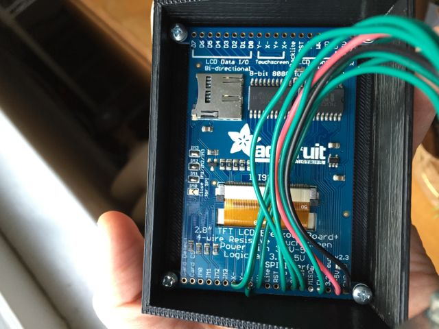
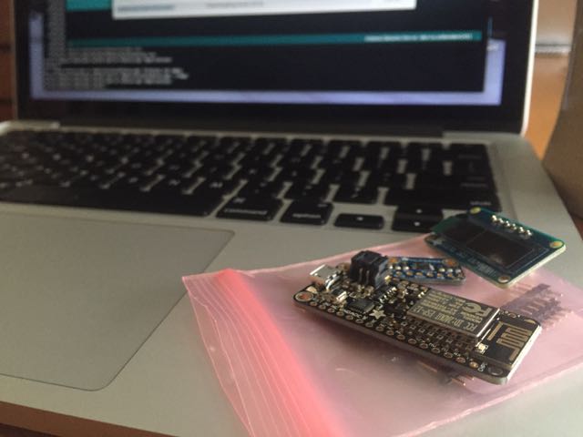
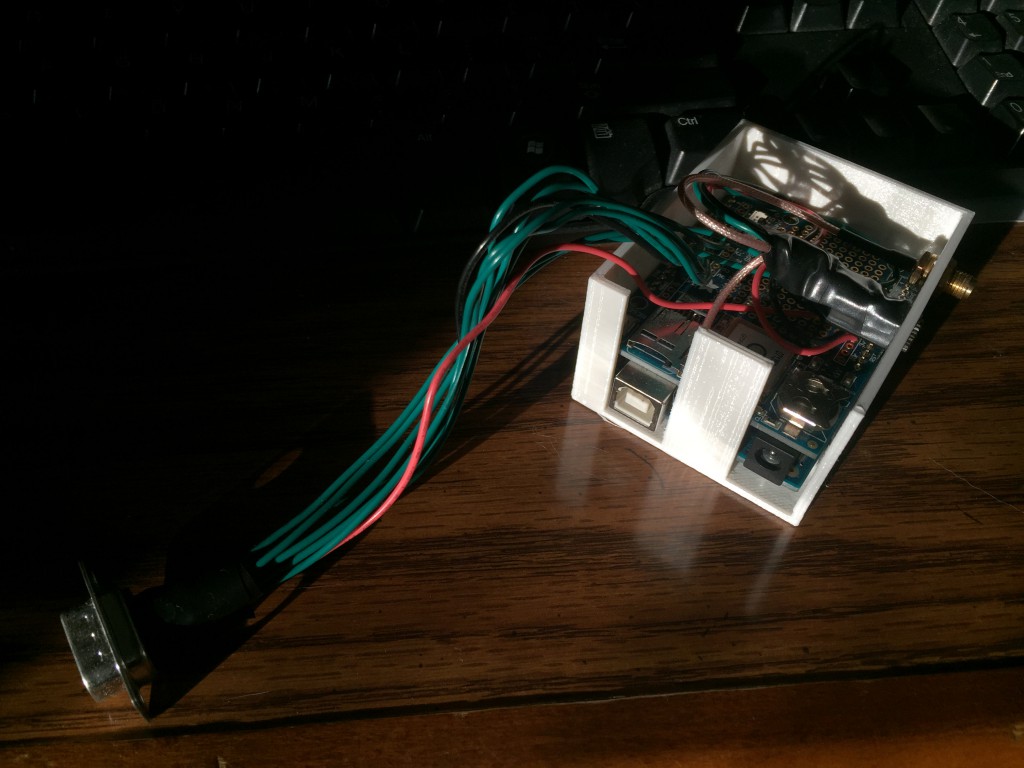
I recently became aware of Adafruit’s new Arduino-compatible line of development boards, Feather. The Feather HUZZAH, is particularly interesting, as it has built-in WiFi (based on the ESP8266 chipset), and costs only $16. With a Feather HUZZAH and a temperature sensor, like the MPC9808 I2C breakout, I could put together an inexpensive monitor. I happened to have a spare, small I2C OLED display that I could add to the mix for a bit of feedback.

Components

The code to initialize and control the temperature sensor and OLED is short and easy. The loop() portion of the sketch reads the temperature, puts it on the display, and if 15 minutes have passed since the last time data was sent to the server, send the temperature to the server and reset timer variable. Finally, shut down the temp sensor and sleep for two seconds. It looks like this:

void loop() {
  float f = tempsensor.readTempF();

  display.clearDisplay();
  display.setCursor(0,0);
  display.print(f, 1);
  display.print('F');
  display.display();

  if (millis() - send_timer >= 1000 * 60 * 15) {
    WiFiClient client;
    if (!client.connect(host, httpPort)) {
      Serial.println("connection failed");
    }
    else {
      client.print(String("GET ") + url +
        "?code=" + mac + "&tval=" + f + " HTTP/1.1\r\n" +
        "Host: " + host + "\r\n" + 
        "Connection: close\r\n\r\n");
      send_timer = millis();
    }
  }

  tempsensor.shutdown_wake(1);
  delay(2000);
  tempsensor.shutdown_wake(0);
}

The only problem I had was that when I tried uploading the sketch to the HUZZAH, I got the error,

warning: espcomm_sync failed
error: espcomm_open failed

A bit of research indicated that to upload a sketch, I’d need to connect Pin 0 to ground and reset the unit (either by power cycling it, or by hitting the reset button).

Pin 0 to Ground

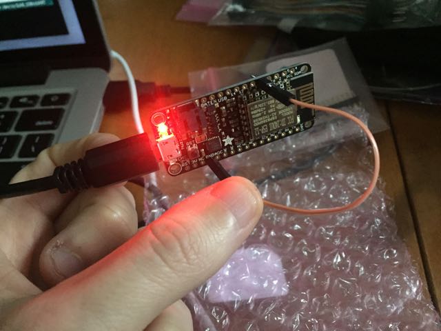
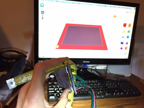
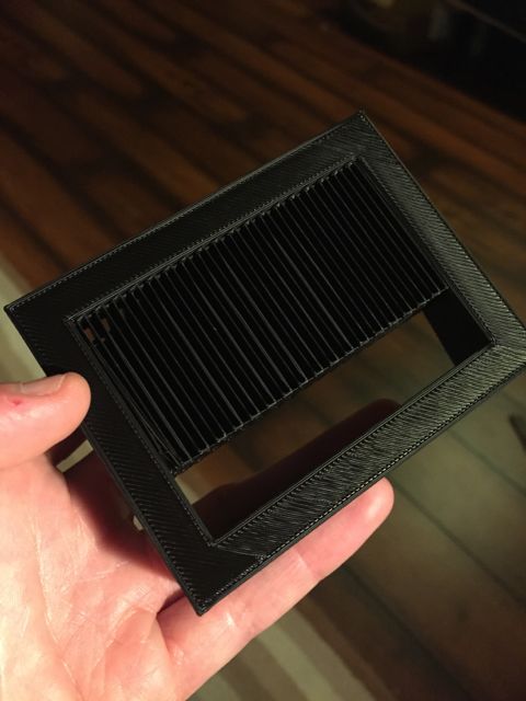
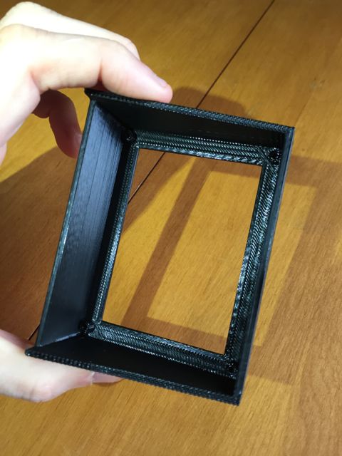
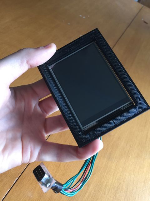
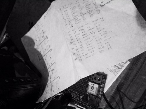
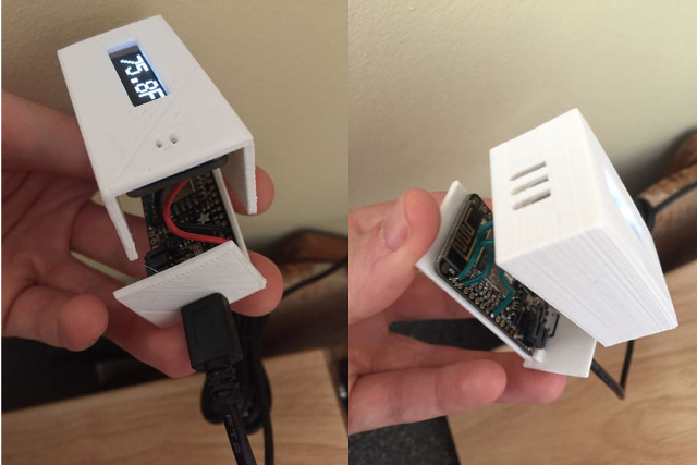
With Pin 0 held to ground, the sketch uploaded. After connecting the temp sensor and OLED, the device seemed to measure the temperature accurately. I took some dimension measurements, and designed an enclosure in TinkerCAD. By the time I had soldered the connections, the two pieces of the enclosure had finished printing.

Enclosure

The last component for this project is a server-side piece that could record the temperature. In the simplest case, I could set up a page that listens for incoming data, and sends me an email or text message when a temperature is posted below some threshold. But I wanted also to be able to see trends over time. So I needed to store readings in a database. Since I might want to have multiple temperature monitors running in several locations, I need to record a source with each temperature reading. To normalize the database, I split the source and measurement into two tables, like this:

mysql> describe sources;
+-------+-------------+------+-----+---------+----------------+
| Field | Type        | Null | Key | Default | Extra          |
+-------+-------------+------+-----+---------+----------------+
| id    | int(11)     | NO   | PRI | NULL    | auto_increment |
| code  | varchar(64) | YES  | MUL | NULL    |                |
| name  | varchar(64) | YES  |     | NULL    |                |
+-------+-------------+------+-----+---------+----------------+
3 rows in set (0.00 sec)
mysql> describe temps;
+-------------+--------------+------+-----+-------------------+-----------------------------+
| Field       | Type         | Null | Key | Default           | Extra                       |
+-------------+--------------+------+-----+-------------------+-----------------------------+
| id          | int(11)      | NO   | PRI | NULL              | auto_increment              |
| source_id   | int(11)      | NO   | MUL | NULL              |                             |
| measured_at | timestamp    | NO   |     | CURRENT_TIMESTAMP | on update CURRENT_TIMESTAMP |
| temperature | decimal(4,1) | NO   |     | NULL              |                             |
+-------------+--------------+------+-----+-------------------+-----------------------------+
4 rows in set (0.00 sec)

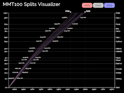
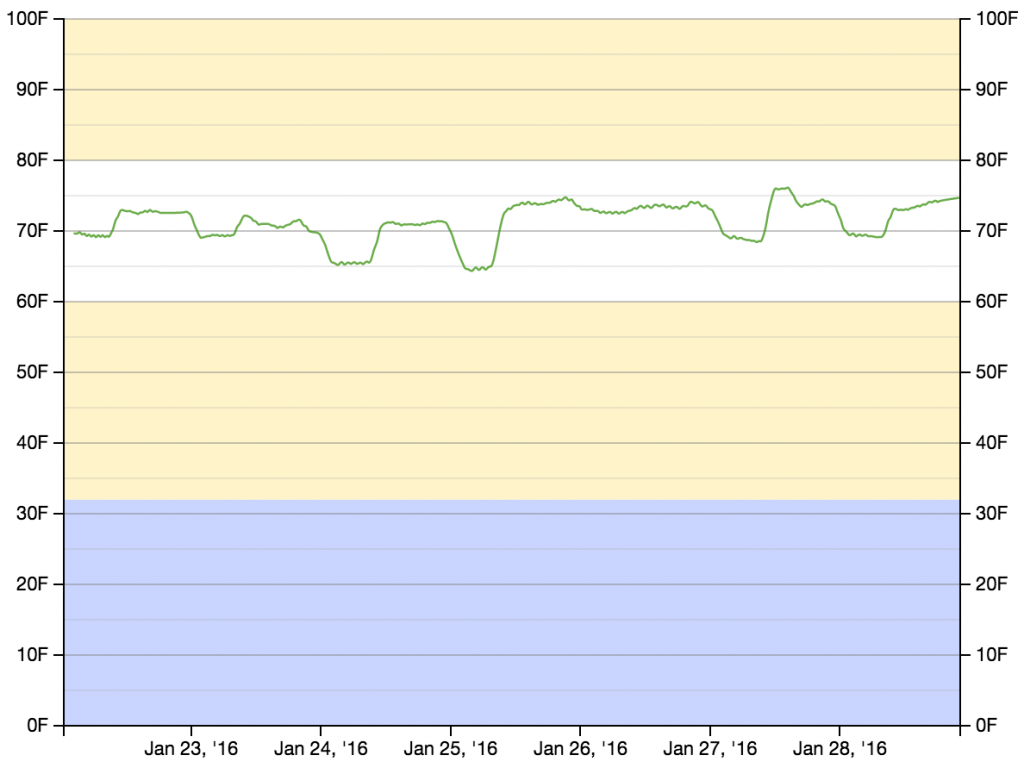
After I had recorded temperature measurements for several days, I had enough data to start putting something on a graph. Rather than building a graphing mechanism from scratch, I repurposed some D3 code that I had written for my UltraSignup Visualizer (which was, at least in part, repurposed from my MMT Graph project). The D3 code pulls data (as JSON) from a PHP script that retrieves temperature measurements and timestamps from some specified source. It then draws the graph, and adds the (slightly smoothed) measurements.

// Smooth temperature readings over avglen measurements
var temperatures = [];
var cur_temp = 0;
var avglen = 8;
var i = 0;
// Seed the running average
while (i < (avglen - 1) && i < results.length) {
  cur_temp += (1.0 * results[i].t);
  i++;
}
// Populate the running average (cur_temp) as a FIFO list of avglen length
while (i < results.length) {
  cur_temp += (1.0 * results[i].t);
  temperatures[temperatures.length] = {x: results[i].d, y: (cur_temp / avglen)};
  i++;
  cur_temp -= (1.0 * results[i - avglen].t);
}

// Create the SVG line function
var line = d3.svg.line()
   .interpolate("basis")
   .x(function(d, i) { return xScale(new Date(d.x)); })
   .y(function(d) { return yScale(d.y); });

// Add the data to the graph using the line function defined above
svg.append("path")
   .attr("d", line(temperatures))
   .attr('class', 'rank_line')
   .style("fill", "transparent")
   .style("stroke", "rgba(71, 153, 31,.8)")
   .style("stroke-width", 1.25);

Temperature Graph

Now that everything works, I’d like to make a few more of these devices. The main costs are $15.95 for the Feather HUZZAH, $4.95 for the temperature sensor, $17.50 for the OLED display, a few dollars for a micro-USB cable and power supply, and some cents for a few inches of wire and a few grams of PLA (for the 3D printed enclosure). For the cost of the device, the display is disproportionately expensive. Once the device is running, the purpose is to record temperature remotely. If I replace the OLED with a single NeoPixel (which’ll run about $1) that flashes some color code to indicate status, I don’t get the onboard temperature readout, but I DO get the entire device for around $23 (plus the micro-USB cable and power supply). So the next iteration will replace the OLED with a NeoPixel. Stay tuned.

electronics

Jeep Computer Update

A year and a half ago, I wrote about a spanky little computer I built for my Jeep. It had been working like a boss for a little more than a year before it started to malfunction. Whereas it used to acquire a GPS fix almost instantly, it started to take several minutes to find the satellites. And the “trip timer” function (which measured trip time and average speed) no longer worked correctly. Every time the car was powered on, the clock was reset to 7:59pm or 6:59pm (depending on daylight savings status). After getting a GPS fix, the time would correct itself, but as far as the computer was concerned, the trip started at the pre-fix time, often adding several hours to the actual trip time.

My first suspicion was that the external antenna had gone bad. It’s encased in black plastic, and it sits on top of the dashboard. I imagined that the hot, summer sun baked it somehow, so the computer could only use its internal antenna, tucked (with the rest of the main processing unit) tightly under the dashboard. I ordered a new antenna, and started designing a small, protective case that I could print in white PLA, so the antenna would have some protection from direct sunlight. I decided that it would also make sense to replace the black enclosure that I had printed for the display with a white enclosure, and put a back on it for additional protection from the sun. When I pulled the display out of the car, I realized that the heat had taken a toll. The black enclosure had melted, and was drooping around the display.

Enclosure Before

Before: The enclosure was nice and square when it was first installed.

Enclosure After

After: A year and a half in the sun took its toll.

I literally had to cut away the enclosure to get the display out of it, as the PLA had so tightly molded itself around the back circuit board. Fortunately, I now have my own 3D printer, so I could use the same STL file to print a new copy of the enclosure, and design a cap to provide some shade for the back side of the display circuit board.

Finally, the main processing unit — the Arduino with the GPS shield, and all the assorted connections — was shoehorned into an awkwardly shaped, generic enclosure that I had purchased at Radio Shack [moment of silence, please]. So that was due for a new, custom enclosure. I made a pretty simple box, with some cutouts for the power and USB connectors, and holes where I could mount the GPS antenna connector and temperature sensor plug.

New Enclosure

After putting all of that together, the new antenna I had ordered arrived. I tried it out… And it made no difference. So on to the next step of troubleshooting. I remembered that the GPS shield had a built-in real time clock (RTC). That would have been the module responsible for maintaining the time when the device was powered off. I assumed also that keeping accurate time between power cycles would allow the GPS to establish a faster fix on the satellites. I pulled out the RTC battery (which was a CR1220 form factor). My multimeter happens to be dead now (due to a blown fuse) so I couldn’t test it. Fortunately, batteries are cheap. I got a new battery, and now the time is correct upon powering up, and the unit gets a fix within a few seconds. In the interim, I did make a minor tweak to the Arduino code. Previously, I depended on the unit maintaining the correct time between power cycles, so I started the trip calculation (time and average speed) immediately. Now, I wait until the GPS has a fix to start the calculations. In the normal case, the fix only takes a few seconds. However, the next time the battery dies, it will still affect the time it takes to find the satellites, but it will no longer cause the trip calculations to be totally erroneous.


programming

Sudoku, part 1

I know, I know. I’ve been MIA from this blog. And I feel just terrible about it. I haven’t abandoned it. I always have plenty of projects going on. Lately, I’ve just been wrapped up with a large project that has taken quite a bit of time. Lots of 3D printing and photography and working with new and interesting bits of software. I’m not ready to say much else about it right now.

Lately, though, I’ve had a bit of time to work on other projects. I decided to dig up a half-done Sudoku related project, to give it some polish. The crux of the project is a Sudoku solver (that I intend to write about at some point in the future). I decided that I needed an interface to the solver, so I put together this handy little web interface.

It allows the user to enter an initial puzzle, or to pull a random, pre-made puzzle. After the initial board is set, the user can allow for forbid impossible moves (that is, moves that would conflict with a number that is already set in the same row, column, or block). The user can also show pencil marks. Pencil marks are indications of playable numbers at each position.

Pencil Marks

I haven’t yet connected to solver to the interface. That’ll come later. The first priority was getting the board to respond to input correctly. Most of the work for managing the available moves on the board is done by my JavaScript class, Board. The Board class takes care of making sure that a move can be made, and updating all affected squares. The function to place a move in a square will only place the move if it is a legal move, or if the initial board has been set and the option to permit impossible moves is allowed. If the move can be placed, all related squares (squares in the same row, column, or block) are updated.

this.place = function(val, r, c) {
  var av = this.available[r][c];
  var placed = false;
  if ((this.setDone && getEl('impossibles_permit').checked) ||
      1 == av[val]) {
    this.placed[r][c] = val;
    this.updateAffectedLocations(r, c);
    placed = true;
  }
  return placed;
}

Higher level functions that interact with the front end operate outside of the class. The callback used when a move is played either tries to place the move if the keypress is between 1 and 9 (ASCII 49-57), or clear the square on backspace or delete (ASCII 8 or 127, respectively). If the move cannot be placed, blink the square that is blocking it.

function setSquare(e) {
  var k = (e == null ? event.keyCode : e.which);
  if (activesq) {
    var r = activesq.getAttribute('row');
    var c = activesq.getAttribute('col');
    var activepen = getPen(activesq);
    var activepencil = getPencil(activesq);

    if (48 < k && k < 58) {
      var val = String.fromCharCode(k);
      if (myBoard.place(val, r, c)) {
        activepencil.style.visibility = 'hidden';
        activepen.innerHTML = val;
      }
      else {
        var sq = myBoard.findBlocker(val, r, c);
        blinkSquare(sq, errcolor);
      }
    }
    else if (8 == k || 127 == k) {
      myBoard.unplace(r, c);
      activepen.innerHTML = '';
      if (getEl('pencil_show').checked) {
        activepencil.style.visibility = 'visible';
      }
    }
  }
  clearListener();
  return false;
}

A little JavaScript, and a little nice styling… That’s about all that’s involved. I’ll get around to hooking up the solver in the next few weeks.

knitting

Quadruple Cross Mitts

Download the pattern: Quadruple Cross Mitts

I made the first pair of these mitts in 2009. I came up with a rough sketch, then took notes on the design as I went along. I intended to write up the pattern immediately afterward. A year later, when I still hadn’t written up the pattern, I decided I needed to make another pair to make sure that my notes were correct. I did that, and again, failed to formally write up the pattern. My notes sat in a binder for lo these many years, until I finally decided that I would, once again, knit the mitts as a refresher, then write up the pattern. This time it stuck.

Quadruple Cross Mitts

Skills

  • Knit and Purl
  • K2Tog and SSK
  • Circular cast on
  • Circular bind off – Since you’ll be binding off individual fingers a “jog” will be quite noticeable. If you are not confident in this skill, I recommend reviewing the TECHKnitting review of circular bind offs.
  • Cable 1 left and Cable 1 right – If you don’t know how to cable without an extra needle, this would be a good project for learning. There are many tutorials about cabling without an extra needle, such as this or this.
  • M1 with reverse loop
  • Picking up stitches

Joining Fingers

Quad Cross Mitts
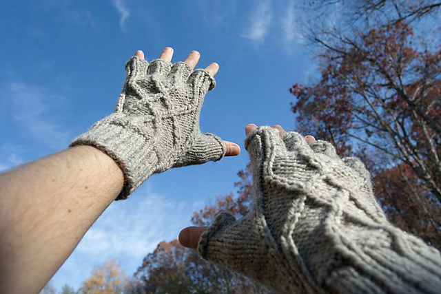
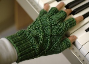
The trick with gloves is not to leave holes between the fingers. I’ve tried several strategies to avoid the inter-digital void; the strategy described in this pattern is the one that I find works best. It is repeated several times in the pattern, and in fact, is a significant contributor to the complexity of the description. If you get your head around the finger joins before beginning the pattern, you’ll find that the whole thing becomes much less complex.

The primary point to recognize is that the finger join involves turning one “tube” into two. We’ll call them Tube A and Tube B. Upon separating Tube A from Tube B, you’ll continue knitting Tube A, and set aside Tube B for later. And that brings us to the second point to recognize: that Tube A and Tube B will not be symmetrical. You’ll be adding a few extra stitches between the tubes, but those stitches will be added differently to Tube A than to Tube B (and most of those stitches will disappear shortly after the base of the join).

So here we go… Get your knitting visualization caps on. You’re knitting the main tube of the work, and you are ready to start a finger. You have arranged the stitches so that the stitches for the finger are on three needles, and the remainder of the stitches are on waste yarn. On the third needle of the finger, you’ll cast on two new stitches with reverse loops, and join it to the first needle. This is the beginning of Tube A. On the next round, you’ll knit the two new stitches through the back loop (to tighten them up). On the round after that, at the stitch before the two new stitches you’ll SSK then K2Tog, effectively removing the two new stitches.

Tube B will come from the remaining stitches. Put those stitches on three needles. On one of those needles, you’ll pick up four stitches from the base of Tube A. As with Tube A, you’ll knit one round keeping all stitches. Then on the following round, you’ll SSK the first of the new stitches with the stitch before it, and you’ll K2Tog the last of the new stitches with the stitch after it. Now you have the base of Tube B.

Gauge

Hand Measurement
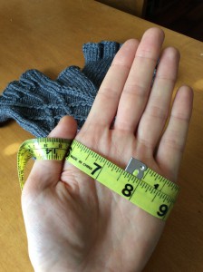
These mitts are meant to be knit at a gauge that would, for most garments, be wrong for the yarn. I’d recommend starting with a yarn that recommends size 8 needles for 4 or 5 stitches per inch, and knit a swatch on size 6 needles. You should end up with a gauge around 5.5 stitches per inch (or 22 stitches per four inches). With the 40 stitches in the main part of the pattern, this gauge results in a tube of approximately 7.25 inches in circumference. That fits well — gives the right amount of negative ease — on a hand that is approximately 7.5 inches around (measured at the knuckles, around the base of the fingers).


Download the pattern: Quadruple Cross Mitts

electronics

3D Printing and Custom Enclosures

I finally got around to finishing my Jeep computer project. I had gotten the Arduino and display working, and I had wired everything together. However, as of my previous post about the project, neither the display nor the Arduino were in enclosures, and the cabin of the Jeep was festooned with wires.

The first step in cleaning up the mess was to purchase an inexpensive, generic, plastic, rectangular enclosure from Radio Shack. I drilled some holes to mount the connections for the Arduino/GPS unit. I put it together and tucked it behind the dash, nice and neat. So most of the wires were gone. The only remaining messy part was the display. I still had the bare display nestled e’er so gently in a knit cap that I’d leave on top of the dash as a pillow for my electronics. I wanted an enclosure that would fit snugly around the display, and that I could mount on the dashboard.

At some point along the way, I learned that the Washington DC public library system has a 3D printing service. For a minimal cost, they would make a print of an object. Fantastic! I just needed to figure out how to create a model. I learned that I was going to need to use a CAD program to create an .stl (STereoLithography) file, which seems to be one of the primary file formats in the 3D printing world.

Of course, I didn’t want to spend thousands of dollars on a CAD program that would take years to learn. Fortunately, there are free, easy-to-learn options, such as SketchUp or TinkerCAD. SketchUp is a native program that runs on Macs and Windows computers. While I have a couple of Macs, and I run various versions of Windows in virtual machines for testing purposes, at home, my primary computer is Linux. TinkerCAD is a very simple, web-based CAD program that works well in any modern browser.

After a basic exploration of TinkerCAD, I was ready to go about designing the custom enclosure for my display. The display is a 2.8″ TFT LCD Touchscreen Breakout from Adafruit. I spent some time searching for specs that list the dimensions, but no such specs were to be found. So I pulled a tape measure out of my knitting kit, and built the CAD model as I measured the dimensions.

TinkerCAD and the Display

My first attempt included a back plane. Having no experience with 3D printing, I didn’t realize that in order to support the back plane during the printing process, the printer would have to lay down a grillwork of plastic that I would have to remove after the fact.

3D Grillwork

I attempted to remove the grillwork, but the plastic is surprisingly sturdy. (In fact, I was originally worried that the 2mm walls of my model would be flimsy, but it ended up being rock solid… Err, in a plastic sort of way.) So I removed the back in the CAD file, and resubmitted. I got back an enclosure that fits the display perfectly.

Enclosure

Enclosure

Enclosure

Enclosure

I considered adding grooves to the enclosure so I could print a separate back plane that could be attached and detached. In the end, I went with simplicity, and I just used a bit of Gorilla Tape for the back. I’ve mounted it on the dashboard (again, with Gorilla Tape until I settle on a more permanent solution), and it satisfies all of my greatest hopes and desires (with respect to a 3D printed enclosure anyway).

Enclosure

Enclosure


electronics

Jeep Seat Heaters

Once you own a car with seat heaters, it’s hard to go back. The old VW had heated seats; the new Jeep did not. Clearly, this state of affairs could not stand.

I found that I could get some nice, neoprene seat covers with built-in seat heaters made by Wet Okole. The Wet Okoles came with heating elements in both the butt-area and the back-area, whereas some aftermarket heaters only heat the butt. I used Quadratec’s “designer” for Wet Okoles. When the seat covers arrived, I installed them, and there was much rejoicing.

Wet Okole Seat Covers

Each seat had a cigarette lighter plug for power, and a push-button switch that allowed setting the heater element to Off, Low, Medium, or High.

Original Switch

Here we get to the problem: While convenient for a quick connection, I didn’t want wires dangling from the seats to the cigarette lighter. Further, I only had one cigarette lighter. Even splitting the circuit for the cigarette lighter wasn’t a great solution, as each seat could potentially draw a little more than 10 amps, and the lighter was on a 20 amp fuse. Splitting the circuit would mean that I’d risk blowing the fuse each time both seats were on full. The Jeep conveniently has a spare 20 amp circuit on the fuse block behind the dash, but it’s an unswitched circuit. If I used that, it’d only be a matter of time before I’d leave the car with a seat heater on, and I’d come back to a dead battery.

After using the seat heaters for a while, I decided that they were keepers, so it was worth investing in a more permanent solution to the power problem — and a solution that would allow both seats to be heated at the same time. I needed to add at least two new 15 or 20 amp, switched circuits to the car, and I wanted controls that were integrated into the dashboard somehow.

For the controls, I started looking around for switches that could put into some existing blanks on the dash. However, after bashing in a heater vent (by transporting some furniture in the passenger seat), I stumbled upon the perfect solution in a Daystar replacement vent with an integrated switch panel.

Vent Switches

The drawback of the rocker switches is that I would no longer have Low or Medium settings. The seat heaters would either be off, or fully on. But really, who need a “lightly warmed” bum in winter? If it’s cold enough to turn ’em on, turn ’em on ALL THE WAY, I say!

For the circuits, I found that Painless Performance makes three- and seven-circuit add-on fuse blocks. I decided to go with the seven-circuit block to give me room for expansion in future, yet-to-be-conceived projects (such as my Arduino-based trip computer). That gave me four new switched circuits, and three new constant circuits, all at 20 amps.

The parts arrived, and so I got to connecting all the pieces. The trickiest decision was where to mount the new fuse block. I had initially intended to mount it behind the glove compartment, next to the existing internal fuse block, but there wasn’t enough room. Perhaps I could have found another spot behind the dash, but I didn’t want to put it somewhere that would require ripping open the dash to access it (in case I should need to replace a fuse). There was an empty spot in the engine compartment (for a second battery, I suppose, to power a winch that I’m unlikely to add) that seemed like a good candidate. Being in the engine compartment, I wanted to add a bit of protection to the block, as it wasn’t marketed as a weatherproof component. So rather than mounting it directly, I mounted it to the inside of a small tupperware bin. I drilled a few ventilation holes in the bin, and a larger hole to run the wires, then mounted the bin in the engine compartment.

Placement of fuse block

The new fuse block is in a ventilated tupperware bin, mounted near the back-driver-side of the engine compartment.

The fuse block had three sets of wires:

  1. Two wires to connect to the positive and negative poles of the battery to power the circuits.
  2. A single wire that needed to be connected to an existing switched circuit. This wire poweres an internal relay that controlled the switching of the four switched circuits in the fuse block.
  3. Seven hot wires for the seven new circuits.

Since the fuse block was already in the engine compartment, running the first set of wires to the battery was fairly trivial. The rest of the wires, though, had to make it into the cabin, which meant getting them through the firewall. I spent more than a few minutes looking for an accessible, existing run through the firewall, and was met with no success. I refered to Dr. Google, and learned that a hard, rubber plug near the gas pedal is the preferred channel — just make a hole straight through it. I made the hole, and pulled the wires through.

Wires run through the firewall

To get the wires through the firewall, I had to make a hole in a rubber plug that seemed to exist for exactly that purpose.

For the relay wire, I tapped into the hot line for the cigarette lighter — I just cut away a centimeter of insulation, joined the relay wire, and wrapped it up neat and tidy with electrical tape. The remainder of the work consisted of running wires up and down behind the dash: hot circuit wires to switches, switches to positive wires for the seats, switches to ground, seats to ground.

As of this blog post, the seats have been keeping my bum warm for more than two winters. A boy could hardly ask for more.

Switches

programming

UltraSignup Visualizer


Instructions

  • In the text box at the top of the graph, enter the full name of a runner whose results can be found on UltraSignup, then hit enter.
  • The points on the graph represent individual race results for the given runner. Move your mouse over a point to see details of that race.
  • The line represents the evolution of the runner’s UltraSignup rank.
  • Timed events (eg, 12-hour races, 24-hour races) appear as empty circles. It seems that as of mid-October, 2014, timed events are included in the ranking. However, it is not clear to me if that change is retroactive, and in some circumstances, I cannot get my calculation of the ranking to line up with their calculation of the ranking. So if you have a large number of timed events in your history, the line I’ve calculated might be e’er so slightly off. The ranking reported below the graph is the official number, provided by UltraSignup.

Background

[Update: The friendly folks at UltraSignup came across this, and they liked it. I worked with them to get it integrated into the official runner results page. So now you can click the “History” link just below a runner’s overall score on UltraSignup and see the plot on the results page. Though if you like the spanky transitions between runners, you still need to come here.]

In the world of ultrarunning, it seems that the ranking calculated by UltraSignup has become the de facto standard for ranking runners. I think that part of the reason for its acceptance is its simplicity. A runner’s rank in a single race is just the ratio of the winner’s finish time to the runner’s finish time. So if you win a race, you get a 100%; if you take twice as long as the winner, you get a 50%. The overall ranking is a single number that represents an average of all of a given runner’s race rankings. If you were to look up my results on UltraSignup, you would see that as of this moment of this blog post, my 10+ years of racing ultras has been boiled down to a ranking of 88.43% over 48 races.

Of course, with simplicity comes inflexibility. What that number doesn’t capture is change over time. By summing up my results as a single number, it’s hard to see how my last few years of Lyme-impaired running have affected my rank, or how my (hoped-for) return to form will affect it. I was curious to see how runners progress over time, and how it affects the UltraSignup rank. In looking at the details of how UltraSignup delivers their rank pages, I noticed that the results come as JSON strings. Therefore, I realized, I wouldn’t even have to do any parsing of irregular data. I could just pull the JSON, and use my handy D3 skillz to put the results in a scatter plot.

I won’t go into great depth about implementation details. If you happen to be interested, you can go to the source. A passing familiarity with D3 would be helpful, but familiarity with only vanilla Javascript should allow you to get the gist.

Oh, and be aware that since this pulls data from UltraSignup, it’s entirely possible that it will stop working someday, either because they change the way they deliver data, or because they don’t like third parties creating mashups with their data. Also, this doesn’t work on Internet Explorer 8, or earlier. Sorry ’bout that!

knitting

Faux Cable Hat

Download the pattern: Faux Cable Hat

The standard technique for moving a column of stitches across a pattern is cabling, in which one or more stitches are passed over one or more other stitches while knitting a row. However, a column of stitches can also be moved across a pattern by balancing increases on one side of the column with decreases on the other side of the column. As an exercise in this technique, I started drawing up a chart with two such columns, criss-crossing is opposite directions.

I ended up with what I call my Faux Cable Hat. It’s a subtle pattern — without the bulk of real, honest-to-goodness cables — that looks best in a single color yarn.

Also, it can be knit with either a foldable brim, or a short, simple brim.

One note about the increases: All increases have either a “left” or “right” lean, specified as M1L and M1R, respectively. M1L is made by lifting the bar between the current two stitches from the front, and knitting through the back loop. M1R is made by lifting the bar between the current two stitches from the back, and knitting through the front loop. Further information about these two techniques can be found at,

http://www.twistcollective.com/collection/component/content/article/92-how-to/1046-make-1-left-or-right-m1-m1l-m1r

I occasionally become bleary-eyed, and forget which type on increase requires lifting the bar from which side. Eventually, I came up with the mnemonic that M1L lifts the bar from the Front, because L and F are similar (both letters are constructed with only horizontal and vertical lines). Likewise, M1R lifts the bar from the Back, because R and B are similar (both letters are constructed with a rounded shapes).

Download the pattern: Faux Cable Hat

programming

Race Progress Visualization Using D3

[The project referred to in this post can be found at http://vestigial.org/MMT/ ]

I’ve been looking for some better tools to produce interactive, data driven, visually appealing web content. In the past couple of years, I’ve become enamored with R for analysis and visualization, but the graphic results are static. (Sure, there are tricks to create animations, but I’m not looking for workarounds.) I occasionally use Google Charts when I need to put together a quick visualization, but they don’t provide quite the level of flexibility I’d like. I started looking at either working directly with SVG or Canvas DOM elements, or using a Javascript SVG library that would allow me to avoid the low-level details.

The most interesting possibility was the D3 framework. D3 — for Data-Driven Documents — is an entire framework for DOM manipulation in data-driven sites. Browsing through the examples on the D3 site, I recognized several memorable visualizations that have appeared on one of my favorite blogs through the years, Flowing Data. It is possible to use D3 for SVG construction and manipulation while non-data-driven portions of the site are handled by, eg, jQuery or standard Javascript. But as long as you’re already using the bandwidth to load the framework, you might as well drop other frameworks, and use the tools that D3 provides.

I was keen to get some experience with D3. When learning a new technology, I prefer to dive straight in — come up with a short, but non-trivial project that I can build. In this case, I came up with a project that melds technology, data visualization, and ultrarunning. The Massanutten Mountain 100 Mile Trail Run (or MMT) is in a few weeks. In such a long race, runners and crews like to have some idea when they’ll arrive at intermediate points along the course if they’re aiming for some given finish time. Conversely, knowing when they’ve arrived at points along the course can help to predict what sort of finish time to expect. While I’m not the first person to provide a visualization, or some tool to correlate aid station splits with finish times, it’s fun to put together something that’s visually appealing and useful.

Showing data from 2011 and 2013 for finishers who finished between 20:59 and 25:55, race time. The horizontal axis is time and the vertical axis is distance, labeled on the left with mileage at each aid station, and on the right with the aid station name. Each diagonal line represents a single racer. Intermediate times on the graph show first and last racer times of arrival at each aid station (for racers in the result set).

Showing data from 2011 and 2013 for finishers who finished between 20:59 and 25:55, race time. The horizontal axis is time and the vertical axis is distance, labeled on the left with mileage at each aid station, and on the right with the aid station name. Each diagonal line, or “track”, represents a single racer. Intermediate times on the graph show first and last racer times of arrival at each aid station (for racers in the result set). Tufte would be proud.


There are several interactive components that I think are noteworthy. First, I provide on-demand data loading. When the page loads, none of the race results is loaded. When a year is selected, the page checks whether the data have been downloaded. If not, it fires an AJAX request, and saves the data so the results can be turned on and off.

The page also provides sliders to limit the result set based on finish time. Each limiter consists of three components: a triangular slider widget (represented by an SVG path element), a time display (represented by an SVG text element), and a vertical guide line (represented by an SVG line element). When the widget is slid, all three elements should move in unison, and the time display should update with the time value at the current point. As a bonus, the vertical guide gets brighter. So I needed to be able to address each element individually, but move them in unison. To build that, first I needed to define the shape for my widget (note that in SVG coordinates, the top left is [0,0]):

var limpolygon = [{x: 0, y: 0}, {x: 10, y: 0}, {x: 5, y: 10}, {x: 0, y: 0}];

I also need to define a function to tell D3 how to interpret the data above. I can use d3.svg.line() to return a function for this purpose. Since I’ve built the object with straight-forward X and Y coordinates, I just need to build a simple function based on those values:

var limline = d3.svg.line()
  .interpolate("linear")
  .x(function(d) { return d.x; })
  .y(function(d) { return d.y; });

Finally, I put the group together. I define a group element (“g”), and append the widget, which I construct in place. I then use the D3 selector to reselect the group, and add the line, then the text:

svg.append("g")  // Create the group, append it to the svg object
  .attr("id", "lim1")
  .attr("transform", "translate("+lim1x+","+limy+")")  // Put it into position
  .append("path")  // Create "path" element for widget, and append it to group
    .attr("id", "lim1_point")
    .attr("d", limline(limpolygon))  // A path has a "d" attribute which gives
                                     // instructions for drawing. Our limline()
                                     // translates raw data into path data
    .attr("fill", "white")
    .on("mousedown", function() {
      capt = "lim1";
      d3.select("#lim1_line").style("stroke-opacity", "1");
    });

d3.select("#lim1").append("svg:line")   // Create line element, append to group
  .attr("x1", limhalfw)
  .attr("y1", ex_pad.top)
  .attr("x2", limhalfw)
  .attr("y2", height - ex_pad.bottom)
  .attr("id", "lim1_line");

d3.select("#lim1").append("svg:text")   // Create text element, append to group
  .attr("id", "lim1_time")
  .text("00:00")
  .style("text-anchor", "end")
  .attr("transform", "translate(-2)");  // Push it 2px to left, for a nice gap

In my view, the coolest trick is making the data respond to the sliders. Whereas showing or hiding the individual years relies on a small number (3) of discrete values, I need to show or hide individual race results based on what is essentially a continuous scale. This involves several steps. First, when adding each track to the graph, I need to attach the finish time to it. Fortunately, HTML5 provides the ability to specify arbitrary data attributes with the data-* construct.

lineset.enter()
  .append("path")
  .attr("data-finish", function(d) {  // Add the data-finish attribute
    return d.finish;
   })
  .style("stroke-opacity", function(d) {
    if (d.finish > finScale(lim2x) || d.finish < finScale(lim1x)) return "0";
    else return ".3";
   })
  .datum(function(d) { return d.splits; })
  .attr("class", "rtrack line " + iden)  // Classes to use later in selectors
  .attr("d", line);

Above is the code to add the tracks. While it might not make much sense if you are not familiar with D3, the key point is the third line. The object has a data object, d, applied to it, and on that line, we set the data-finish attribute to the value of d.finish. (Directly below that, we set the opacity of the line to 0 (making it invisible) if it falls outside of our specified range, or .3 if it is inside the range. But we’re getting ahead of ourselves.)

The next thing we need to a way to translate the location of a slider into a finish time. D3 provides “scales” for just such a purpose. Usually, D3 scales are used to translate some real world value to a pixel position. In this case, we want to do the reverse. I want to build a function that will translate an input domain of a pixel position into the output range of a race time, which in this case is between 0 and 36 hours.

var finScale = d3.scale.linear()
  .domain([lim1x, lim2x])
  .range([0, 36]);

(An astute reader who is familiar with D3 might note that somewhere else, I must have defined a scale to translate from times to pixel values. In that case, someone might wonder why I don’t just use linear.invert() to translate a range value into its corresponding domain value. The answer is that the scale that translates from time to position uses a domain defined by the time of day as a date object, whereas in this case, I want to translate between position and a floating point number representing the finish time in hours (with minutes represented in the fractional portion of the number). Hence the need to define a new scale.)

In this case, lim1x is the initial pixel position of the lower limit slider, and lim2x is the pixel position of the upper limit slider. That produces a function that can be called as finScale(px_pos) to return a corresponding race time. I can then use that in the function that is called when a slider is released.

function updateRange() {
  var fin1 = finScale(lim1x);  // Translate pixel positions to finish times
  var fin2 = finScale(lim2x);
  d3.selectAll(".rtrack").transition(500).style("stroke-opacity", function(d) {
    if (this.getAttribute("data-finish") > fin2 ||
        this.getAttribute("data-finish") < fin1) return "0";
    else return ".3";
  });

  updateAidStationTimes();
}

That function translates the current pixel positions of the sliders into race times (fin1 and fin2). Then it uses d3.selectAll to get every item with the class “rtrack” (which is every race line displayed on the graph), applies a 500ms transition time to the following step, then sets the stroke-opacity style based on a function that checks whether the custom attribute data-finish is in the range defined by the limiters. Finally, it calls updateAidStationTimes(), which I won’t explain in detail here, but it uses d3.extent() with a custom accessor function to find the first and last arrival time of racers in the result set at each aid station. (If you’re particularly interested, you can always dig it out of the source.) It then updates the times displayed on the graph, and moves them into the proper positions.

I started the project on Saturday morning with no experience in D3 (or with SVG graphics), and I finished Sunday evening. I even had time to get out for a bike ride, a run, and a trip to the library to get a movie (which I also watched over the weekend). In the course of this project, I came to appreciate just how massive D3 is. I’m starting to get a feel for it, but this project just scratched the tip of the D3 iceberg (though I’m not sure one would really scratch an iceberg, the tip or otherwise).

[The project referred to in this post can be found at http://vestigial.org/MMT/ ]

knitting

A Sweater

While in Iceland for the Laugavegur Ultra Marathon, Martha and I came across the storefront for the Handknitting Association of Iceland. I took the opportunity to stock up on yarn. The Álafoss Lopi was ridiculously inexpensive, so I got a sweater’s worth of it.

sweater_detail

After a bit of consideration, and consultation with Martha, we decided on a forest green main color, with some yellow and white for contrasting colors. I didn’t really know what I was going to do with it.

sweater_front

I ended up working the standard seamless design from Elizabeth Zimmerman’s Knitting Without Tears.  I started with a provisional cast on, and reversed it with a perl round after a few inches to give me a straight, hemmed edge. I did the same around the sleeves. The touch of color on the inside makes me happy.

sweater_hem

I made up the yoke as I went along. You put in so much work for something like that, and you have no idea whether it’ll fit until it’s pretty much done. So you need to enjoy the process, and accept that in the end you might walk away with something that sucks. If it comes out right, well, that’s just a bonus.

sweater_seated