Tag Archives: programming

electronics

Feather HUZZAH Temperature Monitor

I recently visited the cabin, and it was cold. Like, excessively cold. Like, 37 degrees, which is perilously close to pipes-freezing cold. The thermostat shouldn’t allow that to happen. I hadn’t been there for more than a month, so I don’t know how long there had been a problem, but clearly, the thermostat or furnace wasn’t working. I went into the crawlspace under the house, pulled some panels off the furnace, and did a bit of troubleshooting on my own. Then I did a bit of troubleshooting with an HVAC guy on the phone. Eventually, we determined that something was, indeed, broken. The HVAC guy came out, replaced the controller board on the furnace, and I had heat again.

At the office, I build and maintain complicated software systems. Any sufficiently complicated system is going to have unpredictable failure modes. I accept that I can’t avoid all possible failure modes, but once I recognize a critical failure class, I build monitors to alert me to any failure in that class. It’s what I do in software, so it makes sense to do it in hardware as well. I don’t know all the failure modes of the heating system in the cabin, but failure of the heating system is certainly a failure class that could have very bad (as in, expensive) consequences.

I recently became aware of Adafruit’s new Arduino-compatible line of development boards, Feather. The Feather HUZZAH, is particularly interesting, as it has built-in WiFi (based on the ESP8266 chipset), and costs only $16. With a Feather HUZZAH and a temperature sensor, like the MPC9808 I2C breakout, I could put together an inexpensive monitor. I happened to have a spare, small I2C OLED display that I could add to the mix for a bit of feedback.

Components

The code to initialize and control the temperature sensor and OLED is short and easy. The loop() portion of the sketch reads the temperature, puts it on the display, and if 15 minutes have passed since the last time data was sent to the server, send the temperature to the server and reset timer variable. Finally, shut down the temp sensor and sleep for two seconds. It looks like this:

void loop() {
  float f = tempsensor.readTempF();

  display.clearDisplay();
  display.setCursor(0,0);
  display.print(f, 1);
  display.print('F');
  display.display();

  if (millis() - send_timer >= 1000 * 60 * 15) {
    WiFiClient client;
    if (!client.connect(host, httpPort)) {
      Serial.println("connection failed");
    }
    else {
      client.print(String("GET ") + url +
        "?code=" + mac + "&tval=" + f + " HTTP/1.1\r\n" +
        "Host: " + host + "\r\n" + 
        "Connection: close\r\n\r\n");
      send_timer = millis();
    }
  }

  tempsensor.shutdown_wake(1);
  delay(2000);
  tempsensor.shutdown_wake(0);
}

The only problem I had was that when I tried uploading the sketch to the HUZZAH, I got the error,

warning: espcomm_sync failed
error: espcomm_open failed

A bit of research indicated that to upload a sketch, I’d need to connect Pin 0 to ground and reset the unit (either by power cycling it, or by hitting the reset button).

Pin 0 to Ground

With Pin 0 held to ground, the sketch uploaded. After connecting the temp sensor and OLED, the device seemed to measure the temperature accurately. I took some dimension measurements, and designed an enclosure in TinkerCAD. By the time I had soldered the connections, the two pieces of the enclosure had finished printing.

Enclosure

The last component for this project is a server-side piece that could record the temperature. In the simplest case, I could set up a page that listens for incoming data, and sends me an email or text message when a temperature is posted below some threshold. But I wanted also to be able to see trends over time. So I needed to store readings in a database. Since I might want to have multiple temperature monitors running in several locations, I need to record a source with each temperature reading. To normalize the database, I split the source and measurement into two tables, like this:

mysql> describe sources;
+-------+-------------+------+-----+---------+----------------+
| Field | Type        | Null | Key | Default | Extra          |
+-------+-------------+------+-----+---------+----------------+
| id    | int(11)     | NO   | PRI | NULL    | auto_increment |
| code  | varchar(64) | YES  | MUL | NULL    |                |
| name  | varchar(64) | YES  |     | NULL    |                |
+-------+-------------+------+-----+---------+----------------+
3 rows in set (0.00 sec)
mysql> describe temps;
+-------------+--------------+------+-----+-------------------+-----------------------------+
| Field       | Type         | Null | Key | Default           | Extra                       |
+-------------+--------------+------+-----+-------------------+-----------------------------+
| id          | int(11)      | NO   | PRI | NULL              | auto_increment              |
| source_id   | int(11)      | NO   | MUL | NULL              |                             |
| measured_at | timestamp    | NO   |     | CURRENT_TIMESTAMP | on update CURRENT_TIMESTAMP |
| temperature | decimal(4,1) | NO   |     | NULL              |                             |
+-------------+--------------+------+-----+-------------------+-----------------------------+
4 rows in set (0.00 sec)

After I had recorded temperature measurements for several days, I had enough data to start putting something on a graph. Rather than building a graphing mechanism from scratch, I repurposed some D3 code that I had written for my UltraSignup Visualizer (which was, at least in part, repurposed from my MMT Graph project). The D3 code pulls data (as JSON) from a PHP script that retrieves temperature measurements and timestamps from some specified source. It then draws the graph, and adds the (slightly smoothed) measurements.

// Smooth temperature readings over avglen measurements
var temperatures = [];
var cur_temp = 0;
var avglen = 8;
var i = 0;
// Seed the running average
while (i < (avglen - 1) && i < results.length) {
  cur_temp += (1.0 * results[i].t);
  i++;
}
// Populate the running average (cur_temp) as a FIFO list of avglen length
while (i < results.length) {
  cur_temp += (1.0 * results[i].t);
  temperatures[temperatures.length] = {x: results[i].d, y: (cur_temp / avglen)};
  i++;
  cur_temp -= (1.0 * results[i - avglen].t);
}

// Create the SVG line function
var line = d3.svg.line()
   .interpolate("basis")
   .x(function(d, i) { return xScale(new Date(d.x)); })
   .y(function(d) { return yScale(d.y); });

// Add the data to the graph using the line function defined above
svg.append("path")
   .attr("d", line(temperatures))
   .attr('class', 'rank_line')
   .style("fill", "transparent")
   .style("stroke", "rgba(71, 153, 31,.8)")
   .style("stroke-width", 1.25);

Temperature Graph

Now that everything works, I’d like to make a few more of these devices. The main costs are $15.95 for the Feather HUZZAH, $4.95 for the temperature sensor, $17.50 for the OLED display, a few dollars for a micro-USB cable and power supply, and some cents for a few inches of wire and a few grams of PLA (for the 3D printed enclosure). For the cost of the device, the display is disproportionately expensive. Once the device is running, the purpose is to record temperature remotely. If I replace the OLED with a single NeoPixel (which’ll run about $1) that flashes some color code to indicate status, I don’t get the onboard temperature readout, but I DO get the entire device for around $23 (plus the micro-USB cable and power supply). So the next iteration will replace the OLED with a NeoPixel. Stay tuned.

electronics

Jeep Computer Update

A year and a half ago, I wrote about a spanky little computer I built for my Jeep. It had been working like a boss for a little more than a year before it started to malfunction. Whereas it used to acquire a GPS fix almost instantly, it started to take several minutes to find the satellites. And the “trip timer” function (which measured trip time and average speed) no longer worked correctly. Every time the car was powered on, the clock was reset to 7:59pm or 6:59pm (depending on daylight savings status). After getting a GPS fix, the time would correct itself, but as far as the computer was concerned, the trip started at the pre-fix time, often adding several hours to the actual trip time.

My first suspicion was that the external antenna had gone bad. It’s encased in black plastic, and it sits on top of the dashboard. I imagined that the hot, summer sun baked it somehow, so the computer could only use its internal antenna, tucked (with the rest of the main processing unit) tightly under the dashboard. I ordered a new antenna, and started designing a small, protective case that I could print in white PLA, so the antenna would have some protection from direct sunlight. I decided that it would also make sense to replace the black enclosure that I had printed for the display with a white enclosure, and put a back on it for additional protection from the sun. When I pulled the display out of the car, I realized that the heat had taken a toll. The black enclosure had melted, and was drooping around the display.

Enclosure Before

Before: The enclosure was nice and square when it was first installed.

Enclosure After

After: A year and a half in the sun took its toll.

I literally had to cut away the enclosure to get the display out of it, as the PLA had so tightly molded itself around the back circuit board. Fortunately, I now have my own 3D printer, so I could use the same STL file to print a new copy of the enclosure, and design a cap to provide some shade for the back side of the display circuit board.

Finally, the main processing unit — the Arduino with the GPS shield, and all the assorted connections — was shoehorned into an awkwardly shaped, generic enclosure that I had purchased at Radio Shack [moment of silence, please]. So that was due for a new, custom enclosure. I made a pretty simple box, with some cutouts for the power and USB connectors, and holes where I could mount the GPS antenna connector and temperature sensor plug.

New Enclosure

After putting all of that together, the new antenna I had ordered arrived. I tried it out… And it made no difference. So on to the next step of troubleshooting. I remembered that the GPS shield had a built-in real time clock (RTC). That would have been the module responsible for maintaining the time when the device was powered off. I assumed also that keeping accurate time between power cycles would allow the GPS to establish a faster fix on the satellites. I pulled out the RTC battery (which was a CR1220 form factor). My multimeter happens to be dead now (due to a blown fuse) so I couldn’t test it. Fortunately, batteries are cheap. I got a new battery, and now the time is correct upon powering up, and the unit gets a fix within a few seconds. In the interim, I did make a minor tweak to the Arduino code. Previously, I depended on the unit maintaining the correct time between power cycles, so I started the trip calculation (time and average speed) immediately. Now, I wait until the GPS has a fix to start the calculations. In the normal case, the fix only takes a few seconds. However, the next time the battery dies, it will still affect the time it takes to find the satellites, but it will no longer cause the trip calculations to be totally erroneous.


programming

Sudoku, part 1

I know, I know. I’ve been MIA from this blog. And I feel just terrible about it. I haven’t abandoned it. I always have plenty of projects going on. Lately, I’ve just been wrapped up with a large project that has taken quite a bit of time. Lots of 3D printing and photography and working with new and interesting bits of software. I’m not ready to say much else about it right now.

Lately, though, I’ve had a bit of time to work on other projects. I decided to dig up a half-done Sudoku related project, to give it some polish. The crux of the project is a Sudoku solver (that I intend to write about at some point in the future). I decided that I needed an interface to the solver, so I put together this handy little web interface.

It allows the user to enter an initial puzzle, or to pull a random, pre-made puzzle. After the initial board is set, the user can allow for forbid impossible moves (that is, moves that would conflict with a number that is already set in the same row, column, or block). The user can also show pencil marks. Pencil marks are indications of playable numbers at each position.

Pencil Marks

I haven’t yet connected to solver to the interface. That’ll come later. The first priority was getting the board to respond to input correctly. Most of the work for managing the available moves on the board is done by my JavaScript class, Board. The Board class takes care of making sure that a move can be made, and updating all affected squares. The function to place a move in a square will only place the move if it is a legal move, or if the initial board has been set and the option to permit impossible moves is allowed. If the move can be placed, all related squares (squares in the same row, column, or block) are updated.

this.place = function(val, r, c) {
  var av = this.available[r][c];
  var placed = false;
  if ((this.setDone && getEl('impossibles_permit').checked) ||
      1 == av[val]) {
    this.placed[r][c] = val;
    this.updateAffectedLocations(r, c);
    placed = true;
  }
  return placed;
}

Higher level functions that interact with the front end operate outside of the class. The callback used when a move is played either tries to place the move if the keypress is between 1 and 9 (ASCII 49-57), or clear the square on backspace or delete (ASCII 8 or 127, respectively). If the move cannot be placed, blink the square that is blocking it.

function setSquare(e) {
  var k = (e == null ? event.keyCode : e.which);
  if (activesq) {
    var r = activesq.getAttribute('row');
    var c = activesq.getAttribute('col');
    var activepen = getPen(activesq);
    var activepencil = getPencil(activesq);

    if (48 < k && k < 58) {
      var val = String.fromCharCode(k);
      if (myBoard.place(val, r, c)) {
        activepencil.style.visibility = 'hidden';
        activepen.innerHTML = val;
      }
      else {
        var sq = myBoard.findBlocker(val, r, c);
        blinkSquare(sq, errcolor);
      }
    }
    else if (8 == k || 127 == k) {
      myBoard.unplace(r, c);
      activepen.innerHTML = '';
      if (getEl('pencil_show').checked) {
        activepencil.style.visibility = 'visible';
      }
    }
  }
  clearListener();
  return false;
}

A little JavaScript, and a little nice styling… That’s about all that’s involved. I’ll get around to hooking up the solver in the next few weeks.

programming

UltraSignup Visualizer


Instructions

  • In the text box at the top of the graph, enter the full name of a runner whose results can be found on UltraSignup, then hit enter.
  • The points on the graph represent individual race results for the given runner. Move your mouse over a point to see details of that race.
  • The line represents the evolution of the runner’s UltraSignup rank.
  • Timed events (eg, 12-hour races, 24-hour races) appear as empty circles. It seems that as of mid-October, 2014, timed events are included in the ranking. However, it is not clear to me if that change is retroactive, and in some circumstances, I cannot get my calculation of the ranking to line up with their calculation of the ranking. So if you have a large number of timed events in your history, the line I’ve calculated might be e’er so slightly off. The ranking reported below the graph is the official number, provided by UltraSignup.

Background

[Update: The friendly folks at UltraSignup came across this, and they liked it. I worked with them to get it integrated into the official runner results page. So now you can click the “History” link just below a runner’s overall score on UltraSignup and see the plot on the results page. Though if you like the spanky transitions between runners, you still need to come here.]

In the world of ultrarunning, it seems that the ranking calculated by UltraSignup has become the de facto standard for ranking runners. I think that part of the reason for its acceptance is its simplicity. A runner’s rank in a single race is just the ratio of the winner’s finish time to the runner’s finish time. So if you win a race, you get a 100%; if you take twice as long as the winner, you get a 50%. The overall ranking is a single number that represents an average of all of a given runner’s race rankings. If you were to look up my results on UltraSignup, you would see that as of this moment of this blog post, my 10+ years of racing ultras has been boiled down to a ranking of 88.43% over 48 races.

Of course, with simplicity comes inflexibility. What that number doesn’t capture is change over time. By summing up my results as a single number, it’s hard to see how my last few years of Lyme-impaired running have affected my rank, or how my (hoped-for) return to form will affect it. I was curious to see how runners progress over time, and how it affects the UltraSignup rank. In looking at the details of how UltraSignup delivers their rank pages, I noticed that the results come as JSON strings. Therefore, I realized, I wouldn’t even have to do any parsing of irregular data. I could just pull the JSON, and use my handy D3 skillz to put the results in a scatter plot.

I won’t go into great depth about implementation details. If you happen to be interested, you can go to the source. A passing familiarity with D3 would be helpful, but familiarity with only vanilla Javascript should allow you to get the gist.

Oh, and be aware that since this pulls data from UltraSignup, it’s entirely possible that it will stop working someday, either because they change the way they deliver data, or because they don’t like third parties creating mashups with their data. Also, this doesn’t work on Internet Explorer 8, or earlier. Sorry ’bout that!

programming

Revoice

Some years ago, I was in need of a new and unique way to taunt a friend. He had made a habit of being especially obnoxious in an certain online forum. But it’s not his obnoxiousness that really bothered me. In fact, many friends and acquaintances would consider me to be chief among purveyors of obnoxiousness.  No… It’s not the obnoxiousness that bothered me. It was the repetition within the obnoxiousness that brought me to action. Every day, it was the same rants, the same complaints, the same stock phrases.

I had, for some time, tried to taunt him by twisting his words, offering clever (according to me) puns, countering him with facts and offering the straight-up observation that he was saying the same thing, day after day. It was like throwing spitballs at a steamroller. Clearly, I needed to step up my game.

My first thought was to compile his most-used stock phrases, create bingo cards with them and distribute those cards to other participants of the forum. That way, even if we had to put up with this repetitive obnoxiousness, at least we could derive some fun from it—and maybe someone could win a prize!

As much fun as that might have been, I decided that I wanted something unique, and bingo had been done. (It hadn’t been done in this particular case. But I wasn’t the first one to think of creating a bingo game based on the phrases someone frequently says.) So I came up with the idea of writing a program that would generate new posts for the forum. The posts would be in the style of the individual of my choosing—using the same vocabulary and phrasing—but would essentially be nonsense. This idea had that dual benefits of being an effective method of taunting as well as being an interesting project.

I had forgotten about this little project for many years. Recently, though, I came across an old, broken laptop. I knew that this laptop had some old projects on it (including a simple 3D drawing program I wrote in college, and some signal processing and computer learning code I had written for a long-extinct dot-com that rode that early-2000s bubble with the best of ’em). I decided to pull the data off the hard drive (a process that ended up being quite a project in itself). I thought my taunting program might be on that disk. But it was nowhere to be found. After some more thought about where and when I wrote the program, I realized that I had written it on a computer from a later era that had since experienced a catastrophic disk failure.

Rather than being disappointed that I had lost that little gem, I decided to recreate it. I recalled that I had written it as a short PERL script that only took a couple hours to code. Although I haven’t touched PERL in six or seven years (other than to make trivial tweaks to existing code), I remembered the premise on which I based the original program, and PERL is certainly the best readily-available tool for this job.

To understand how the program works, you need to understand that everyone has characteristic patterns in their writing or speech—a sort of linguistic fingerprint, or voiceprint. You can do all sorts of analysis on an individual’s language to determine various aspects of that voiceprint. The trick is to find some set of aspects that are not only descriptive, but that could be used generatively.

One component of that voiceprint is vocabulary—the set of words that someone knows and uses. So I could take some sample text, extract the vocabulary used in that text, and use those words in random order. Unfortunately, that would end up as a jumbled mess. The first problem is that most of us share the majority of our vocabulary. There are a few hundred words that make up that majority of what we say. It’s only at the periphery of our vocabulary—words that hold some very specific meaning and that are used infrequently, like “periphery”—where we start to notice differences.

To accomplish my goal, I was going to need a system that would not only use the same words that are in a sample text, but would also use them in a similar, but novel, way. I could take the idea from above—to use the vocabulary—and add the notion of frequency. That is, I wouldn’t just randomly pick words from a vocabulary list. Instead, I would note the frequency of each word used, and pick words with the same probability. For example, if the word “the” makes up 3% of the sample text, then it would have a 3% likelihood of being picked at any particular step in the generated text.

But we still have the problem that the resulting text wouldn’t have any coherence beyond the word level. It would just be a jumble of words strung together. To add coherence, we need context. Context means that we need to look at the way that words are strung together. We can do that by looking at tuples—ordered sets—of words. For the sake of settling on a reasonable number, let’s pick 3. Let’s look at 3-tuples. This paragraph starts with the 3-tuple {But,we,still}. The next 3-tuple is {we,still,have}. Then {still,have,the}, then {have,the,problem}, and on and on.

Looking at tuples, we get a small amount of context.  My question when I started this project was whether that context was enough to build a generative system that could speak in the voice of some training text. Since the tuples are sequences that appear with some known frequency, and since one tuple could be chained to the next by using those known frequencies, I had high hopes.

To understand how this would work, we could train it on a piece of my own writing: my Hellgate 100k race report from 2007. Say I was in the middle of generating new text based on that post, using 3-tuples. Now, say that last two words in my generated text are “going to”. (Forget about how I reached that point, just assume that I’m there.) I need to pick the next word. Based on earlier analysis, I know that the following table shows all of the 3-tuples taken from that post, which start with {going,to}. The number next to each 3-tuple is the number of times the 3-tuple appears in the post.

{going,to,run} (1)
{going,to,win} (1)
{going,to,be} (1)

To be consistent with the sample text, the next word needs to be “run”, “win” or “be”. Based on the frequencies, there is an equal chance of choosing any of the options. Now say that of those options, with those frequencies, we happen to choose “be” as the next word. Our generated text is “going to be”. So we start over, looking for the tuples that start with {to,be}.

{to,be,able} (2)
{to,be,here} (1)
{to,be,very} (1)
{to,be,a} (1)
{to,be,of} (1)
{to,be,running} (1)
{to,be,jogging} (1)
{to,be,at} (1)
{to,be,gathered} (1)

Let’s pick “running”, making our generated text “going to be running”. And on to the next step.

{be,running,for} (1)
{be,running,.} (1)
{be,running,at} (1)

We pick “at”, resulting in “going to be running at”. We are starting to get some text that appears to be somewhat familiar (if you’ve read the sample text) and is syntactically correct, but might be entirely new. (Notice that one of the options in the above example is punctuation. By tokenizing some punctuation—such as periods and commas—the resulting text seems to be more natural.)

The next problem is figuring out how much training text is required to allow the system to generate new text. With a very small amount of training text, the result would not be very interesting. That is because of the relationship between the number of unique 2-tuples and unique 3-tuples. When choosing a new word, we need to look at the final 2-tuple in the generated text. If each 2-tuple is the beginning of only a single candidate 3-tuple—if there is a 1:1 ration between 2- and 3-tuples—then after the first two words are chosen, each additional step will simply extend the generated text with an unaltered section of the source text.

In a very short sample text, the 2- to 3-tuple ratio is likely to be very close to 1:1. As the sample text gets longer, that ratio tends to get smaller.  However, it is not only the length of the text that affects the 2- to 3-tuple ratio; it is also the complexity of the text. Repetition within a text will manifest itself more greatly in smaller portions of text than in larger portions. (Even though they are very close to one another in size, 2-tuples are smaller than 3-tuples, so they will be affected more greatly by repetition.) So a large degree of repetition will result in low 2- to 3-tuple ratio relative to the total length of the text.

It is that second point that drew me to this project. The purpose of this project was to illustrate and emphasize the amount of repetition in an individual’s writing. Therefore, with a relatively small amount of sample text—I collected probably less than 2,000 words of text—the program was able to generate new text in the voice of the original author. Unfortunately, I no longer have that sample text (and the individual in question has stopped posting in that forum).

The race report that I used as an example above has, by my count, 3,687 2-tuples and 4,962 3-tuples, for a ratio of .74. It turns out that that is sufficient to start generating new text. For example, after training on that text, I can generate samples like,

The sixth aid station how far ahead he was ahead of me. Moments later, on a downhill, and I beat the aid station asked how much time I reach Bearwallow Gap. Then I’d restock again, there is a little ball on the leaders. I can do it because I had some soup, hot chocolate, scrambled eggs. I wanted to win, so there was a race. But there were a lot of strong runners on the floor and stomped on until it’s in a little.

Or,

Which brings us to 2007. I felt like there was someone behind me, that’s just post hoc rationalization. Maybe not entirely, but after that, the runner only has the former.

Now we can try to generate something new based on some other text. Hamlet, for example. I took all of the lines that Hamlet speaks in the autonymous play. By my count, in the 11,714 words, there are 10,079 2-tuples and 13,555 3-tuples, resulting in a ratio of .74. Here are some new-and-improved lines for Hamlet:

Let me not burst in ignorance; but, sir, to set on some quantity of choice, To flaming youth let virtue be as wax, And break your own inclining? Is it a free visitation? Come on–you hear this fellow no feeling of his lands will hardly lie in this box; and there is nothing either good or bad, but in the verity of extolment, I pray. The spirit that I have of late–but wherefore I know not of? Thus conscience does make cowards of us all; And now, how cheerfully my mother looks, and on this moor? Ha! have you eyes? Could you on this, The oppressor’s wrong, to hold, as pure as snow, thou shalt not escape calumny.  Get thee to a bawd than the observance. This heavy-headed revel east and west Makes us traduced and tax’d of other nations: They clepe us drunkards, and makes passionate action. The spirit that I know, to this world goes, even in that sleep of death what dreams may come When we have seen, And in this garb, lest I should have fatted all the circumstance?

To be entirely honest, I chose Hamlet because it is a well known work in the public domain. I didn’t really think it through. That certainly looks Shakespearean to me. However, this line of inquiry has made me realize that I can’t necessarily distinguish between actual Shakespearean writing and nonsense that just sounds like Shakespeare.

So I needed something else. I found the 2010 presidential State of the Union address. By my count, in 7,328 words, there are 5,894 2-tuples and 7,649 3-tuples, for a ratio of .77—slightly higher than Hamlet. What do we get from that?

The spirit that has always been our ideals, our values that allowed us to wait for decades, and jeopardize our recovery — all of their income on student loans, and are generous in spirit. These aren’t Republican values or labor values. They’re putting more emphasis on math and science; and turns around failing schools that steal the future was anything but certain. These were the times that tested the courage of our citizens, not our ambitions. So we face big and difficult challenges. And according to the world’s cheapest solar cells or treatment that kills cancer cells but leaves healthy ones untouched.  And when we are responsibly leaving Iraq to its people. Let’s leave behind the fear and division, and I know that some in my own party will argue that we can’t afford it. You hated it. You can see how their money is being spent.

There are some interesting phrases in there. However, it would be interesting to see what happens when processing text with a lower ratio.  I combined the 2001 and 2002 State of the Union addresses to gather a total of 8,221 words. But the ratio of that sample text was the same as the ratio of the 2010 address: .77. So I combined all eight of George W. Bush’s State of the Union addresses. The word count rose to 40,377, and the ratio fell to .64 (24,697:38,632).

Our shared responsibilities extend beyond matters of life and science, and that is precisely what America is the Mayor of Philadelphia. He pursued chemical, and defeatism that refuses to acknowledge that we face a tax increase they do not expect and will not be finished on our country. This year we will see freedom’s victory. In my budget provides more than a third of the people of Egypt have voted in a long way off. But we did nothing to invite. We choose freedom and security reforms. The principle here is greater security in retirement accounts. We’ll make sure that that growth is slowing. So the United States and the peace, the unfair tax on marriage will go to court because they will be effective only if it includes commitments by every major economy and add new jobs, so I ask Congress to pass these measures. I welcome the bipartisan enthusiasm for spending discipline in Washington, D.C.  Opportunity Scholarships you approved, more of America’s military families serve our country by strengthening math and science… bring 30,000 math and science.

It appears that this text bounces around more than the text with a higher ratio. Of course, now that I have a handy little PERL script (which only ended up being about 50 lines of code) to generate text, and some measure of the fitness (the 2-tuple:3-tuple ratio) of the sample text for producing interesting generated text, the next step will be to do some analysis to quantify the “interestingness” of the generated text, and to relate that to the 2-tuple:3-tuple ratio. However, that will have to wait for another day and another post.

In case anyone has interest, the script can be found here.


programming

The Obsessing Over The Splits

“There’s one more piece,” I explained to Martha, “that you have to master.” The previous fall, she had developed a fibroma in her foot that curtailed her running. Hoping to keep her active (ie, non-grumpy), I dragged her to the pool. She never claimed to enjoy swimming, but on Monday and Wednesday nights, she would make sure I was planning on swimming the following morning. Even if she felt like it was a constant struggle, in a few months, she had improved significantly (ie, not nearly as much gasping and clinging to the side of the pool as when she started).

In the spring, she surprised me with her keenness to spend time on a bike. At first, it was mountain biking in West Virginia. Then she got a BikeShare membership so we could ride in Rock Creek Park on the weekends, when they close Beach Drive to traffic. Then she started talking about getting her own bike. After years of referring to bikes as, “The Vehicle Of Death,” I wasn’t sure what to make of it. But I was happy to go along with it. Eventually, I casually mentioned that, what, with all the swimming and biking, she might as well sign up for a triathlon. And much to my surprise, she was game!

I hadn’t raced a tri since 2008, so I was looking forward to a return to the sport. I picked Luray Triathlon (international distance — 1500 meter lake swim, 40km bike, 10km run) in August as a target race, and we got about to training. Well, there really wasn’t so much “training” in a specific sense. I mean, we’d go to the pool once or twice a week, we’d do 40-50 mile bike rides (far longer and hillier than the bike portion of the race) pretty regularly, and running is our bread and butter.

Long story short, she had a great race, despite coming out of the water pretty close to the tail end of the field. She tells the full story on her blog, so I won’t restate it all. But after the race, there was one last lesson of triathlon that she needed to learn — one more piece to master.

“Part of the triathlon experience is obsessing over the results.” In a running race, you might have intermediate splits, but after looking at the results, all you can really say is, “I gotta run faster.” Or maybe, “Look at that positive split! I gotta not race like a friggin’ moron!” But in triathlon, you get your finish time, but also times for the swim, bike, run, and two transitions. So you can say things like, “My swim, bike, and run were awful, and my first transition was slow as dirt… But I ROCKED my second transition!” Yes, obsessing over results, and imagining how much more awesome you would be if you could only swim faster is a grand part of the triathlon tradition.

Looking at Martha’s splits, it’s clear that she’s a weak swimmer (4th percentile of the race), a fair cyclist, and a standout runner (10th overall, including elite men). This seems like a time for some visualizations! The first step was to put the results into a CSV file, and load it into R. I wrote a little function to convert the times to total second, so everything could be compared numerically.

getTime <- function(time) {
  sec <- 0
  if ('' != time) {
    t <- as.integer(strsplit(as.character(time), ':')[[1]])
    sec <- t[1]
    for (i in 2:length(t)) {
      sec <- sec * 60 + t[i]
    }
  }
  sec
}

And I used that in a function that compiles the splits in to a vector.

getSplits <- function(results) {
  splits <- c()
  for (i in 1:length(results$TotalTime)) {
    swim <- getTime(results$Swim[i])
    t1 <- getTime(results$T1[i])
    bike <- getTime(results$Bike[i])
    t2 <- getTime(results$T2[i])
    run <- getTime(results$Run[i])
    penalty <- getTime(results$Penalty[i])
    total <- getTime(results$TotalTime[i])

    if (0 == t1) t1 <- 180 # Default of 3m if missing T1
    if (0 == t2) t2 <- 120 # Default of 2m if missing T2

    # If missing a split, figure it out from total time
    known <- swim + t1 + bike + t2 + run
    if (0 == swim) swim <- total - known
    else if (0 == bike) bike <- total - known
    else if (0 == run) run <- total - known
    
    if (swim & run & bike) { # Exclude results missing two splits
      splits <- c(splits, swim, t1, bike, t2, run, penalty)
    }
  }
  splits
}

From there, I could produce a graph showing color-coded splits in the order of finish for the race.

splits <- getSplits(results)

barplot(matrix(splits, nrow=6), border=NA, space=0, axes=FALSE,
        col=c('red', 'black', 'green', 'black', 'blue', 'black'))

# Draw the Y-axis
axis.at <- seq(0, 14400, 1800)
axis.labels <- c('0:00', '0:30', '1:00', '1:30', '2:00',
                 '2:30', '3:00', '3:30', '4:00')
axis(2, at=axis.at, labels=axis.labels)

Luray Intl. Distance Tri, Overall

Each vertical, multi-colored bar represents a racer. The red is the swim split, green is the bike, and blue is the run (with black in between for transitions, and at the end for penalties). It becomes clear from this graph that Martha was one of the last people out of the water (notice her tall red bar), then had a fair bike ride, but didn’t make up much time there. It wasn’t until the run that she started to make up time. That’s what moved her from the tail end of the field to the top half.

But part of the beauty of obsessing over triathlon results is that there are so many ways to slice and dice the data. It seems only fair that we should look at the sex-segregated results, and of course, triathletes are very into age group results. So we can limit the sets of data to our individual sexes and age groups.

Luray Results

So that’s one way to look at the data. However, that only provided a fuzzy notion of how each of us did in the three sports. For example, my swim time is similar to the swim times of many people who finished with similar overall times. It’s difficult to tell where I stand relative to the entire field.

Perhaps a histogram is more appropriate. For example, I could use my getTime function to create a list of the finish times for everyone.

times <- sapply(results$TotalTime, getTime)

Then it’s trivial to draw a histogram of finish times.

hist(times, axes=FALSE, ylab='Frequency of Finishers', xlab='Finish Time',
     breaks=20, col='black', border='white', main='Histogram of Finishers')

To draw the X-axis, I created a function that translates a number of seconds to a time string with the H:MM format.

# Make a function to print the time as H:MM
formatTime <- function(sec) {
  paste(as.integer(sec / 3600),  # Hours
        sprintf('%02d', as.integer((sec %% 3600) / 60)), # Minutes
        sep=':')
}

# Specify where the tick marks should be drawn, and how
# they should be labeled
axis.at <- seq(min(times), max(times),
               as.integer((max(times) - min(times)) / 10))
axis.labels <- sapply(axis.at, formatTime)

# Draw the X-axis
axis(1, at=axis.at, labels=axis.labels)

That gives me this:

Luray 2014 International Distance Results, Histogram
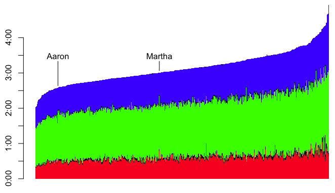
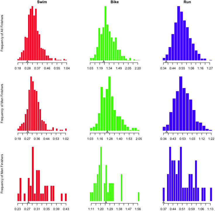
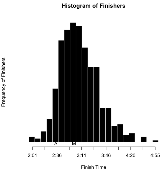
I’ve also inserted an ‘A’ below the results to notate where I finished, and an ‘M’ to notate where Martha finished. However, as I’ve indicated, part of the obsessing over the splits involves slicing the data as many ways as possible. I wanted to see this sort of histogram for each of the sports overall, by sex, and by age group. That’s a nine-way breakdown, for both me and Martha. Fortunately, since the data is all in R, and since I have the code all ready, it’s fairly trivial to make the histograms. They need to be viewed a bit larger than the width of this column, so you can click on the images below to see more detail. Here’s mine:
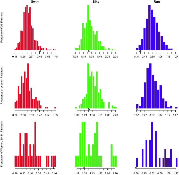
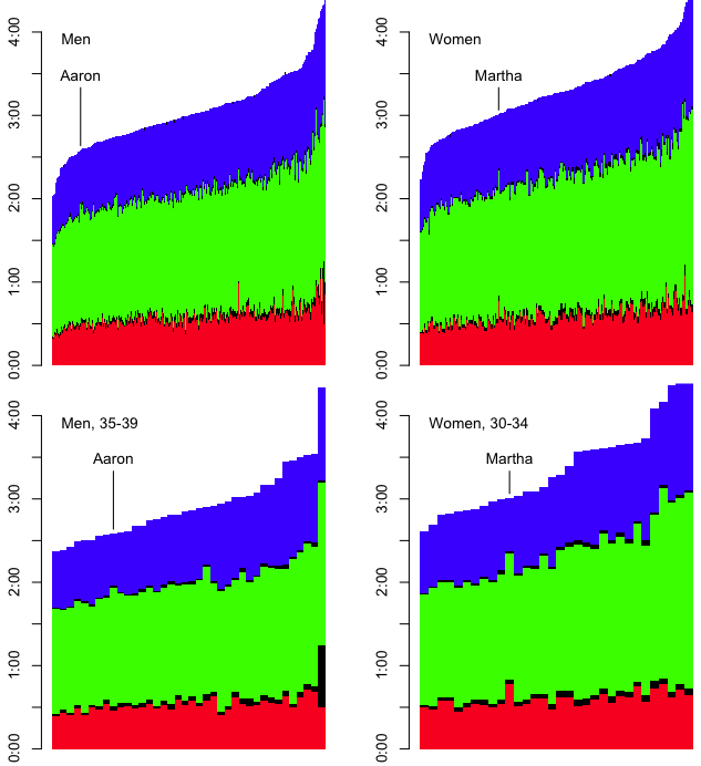
Luray Histogram, AaronLooking at my results, it is clear that I’m a stronger swimmer than cyclist, but it’s really the run that saves my race. Here’s Martha’s:

Luray Histogram, Martha

Notice that in her age group, she had the slowest swim, and the fastest run. She clearly gets stronger as the race goes on.

But there is still (at least) one more way to look at the results. Not only do we want to know how we perform in each of the disciplines; we also want to know how we progress through the race. That is, how do our positions change from the swim to the bike to the run to the finish? I started off with a function similar to “getSplits” above. I called this totalSplits. For a given racer, this produced a vector of the cumulative time after six points in the race: swim, t1, bike, t2, run, penalties. I could use those vectors to build a matrix, which I could then use to build a graph of how race positions changed from the swim to the bike to the finish.

all.totals <- t(matrix(apply(results, 1, totalSplits), nrow=6))
# Exclude results that are incomplete
all.totals <- all.totals[which(all.totals[,6] != 0),]
cnt <- length(all.totals[,1])

# Map the swim, bike, and finish times onto a range of 0 to 1, with
# 1 being the fastest, and 0 being the slowest.
doScale <- function(points) {
  1 - ((points - min(points)) / (max(points) - min(points)))
}
scaled.swim <- doScale(all.totals[,1])
scaled.bike <- doScale(all.totals[,3])
scaled.finish <- doScale(all.totals[,6])

# Plot points for swim, bike and finish places
plot(c(rep(1, cnt), rep(2, cnt), rep(3, cnt)),
     c(scaled.swim, scaled.bike, scaled.finish),
     pch='.', axes=FALSE, xlab='', ylab='',
     col=c(rep('red', cnt), rep('green', cnt), rep('blue', cnt)))

# Add the lines that correspond to individual racers
for (i in 1:cnt) {
  lines(c(1,2,3),
        c(scaled.swim[i], scaled.bike[i], scaled.finish[i]),
        col='#00000022')
}

# Add some axes
axis(1, at=c(1, 2, 3), labels=c('Swim', 'Bike', 'Finish'))
axis(2, at=c(0, 1), labels=c('Last', 'First'))

From that, I get something that looks like this:

Luray Results, Places

It looks like a crumpled piece of paper, so perhaps it needs some explanation. At the left is the placing for racers after the swim from the fastest swimmer at the top, to the slowest at the bottom. In the middle is the placing after the bike, and on the left is the placing at the finish. The first thing I notice is that there seems to be little correlation between placing after the swim and after the bike. The left side of the graph looks like a jumbled mess. The other thing I notice is that the top racers — note that prize money brought some pros to this race — are fantastic all-around. To pick out my results and Martha’s results, I highlighted them in aqua and yellow, respectively.

And for the sake of completeness, we need to break that down by sex and age group.

Luray Placing by Sex and AG

So yes, I suppose the moral of the story is that no one can obsess over results like a triathlete can obsess over results.

And in case anyone wants to play with the results, click the link to get the CSV of the results for the 2014 Luray International Distance Triathlon.

electronics

An Arduino-Based Computer For The Jeep

In my early 20s, I made what, at that point, was the biggest purchase of my life: my little, green Volkswagen. In both a literal and figurative way, it carried me through some formative years. After 11 years, when repair bills were starting to exceed the value of the car, it finally became time to retire The Green Machine. (It wasn’t an easy decision, but I got a very large estimate to weld out a bad catalytic converter, and weld in a new one that would be necessary to get the car to pass its emissions inspection.) In its place, I wanted something that would handle snowy mountains a bit better — that meant four-wheel drive — and something that I could pay for in cash without totally draining the kitty. I ended up with an 11 year old Jeep Wrangler.

The Jeep has several drawbacks over the Volkswagen. It’s loud. It’s a rough ride. Despite seeming to be quite a bit larger, it doesn’t have much carry capacity at all — packing the car for any long trip becomes an exercise in applied geometry and spacial relations. However, it does have one big advantage: it is user serviceable. It’s a great car for modification and personalization. All cars should be so modular. When a side mirror recently broke, my only problem was deciding what kind of mirror I wanted to replace it with. I browsed through the options on Quadratec, picked a set, they arrived two days later, and it took me 20 minutes to replace both mirrors. When I decided that the stock headlights were too dim, I bought new enclosures for a different bulb type, and swapped the old for the new. Busted radiator? Got a new one at the local auto parts store, and swapped it out. Want seat heaters? Add a fuse block, and wire them to switches on the dashboard. (I’m sure I’ll post more about that one later.)

Since I’ve been driving the Jeep, one feature of the VW I have longed for is the little computer that would tell me the temperature outside, how long I have been driving, and my average speed. Maybe I care too much for stats, but I liked to know, eg, This trip was 19 miles, it took 26 minutes, and it is 68° F outside. The Jeep doesn’t even have a clock on the dashboard. No, to be able to see the time, I need to leave the radio (also an aftermarket replacement) on the clock display.

I finally took up the challenge to put together something that would give me the information I so yearned for. I decided to use an Arduino as the microcontroller for the project. I went to my other favorite site, Adafruit, and ordered most of the parts I’d need, such as a digital temperature sensor, a GPS shield, and a touchscreen display. When the parts arrived, it was time to get soldering.

Parts to solder

I had to solder the header pins to the GPS shield, and a set of wires to both the GPS shield and the touchscreen in order to connect them to each other. I didn’t want to connect them directly. The plan was to set it up so the microcontroller/GPS unit would be hidden under the dashboard. The display would be affixed to the top of the dashboard. The temperature sensor would be mounted to the front of a front wheel well, and wires would be run back through the engine compartment, and through a small hole I had drilled in the firewall. But before I could do all of that, I wanted to make sure the basic unit worked. Once I figured out how to interface with the temperature sensor, the touchscreen, and the GPS, it wasn’t particularly challenging to write code to pull data from the sensors, and spit the information to the display. I connected the display to the microcontroller/GPS unit through a breadboard, and plugged a 9V battery into it. It was a self-contained unit that I could plop on top of the dashboard.

Computer on dash

I’m holding the display, which is connected (through the breadboard) to the GPS shield which is plugged in to the Arduino, which is powered by a 9V battery. The display shows the time of day at the top. On the left is the outside temperature (“??? F” since it is not currently connected to the temp sensor), current speed, and altitude above sea level. On the right is current trip information: time, distance, and average speed (“0.0 MPH” because of a bug in my code at that time). At the bottom is the latitude and longitude, and a green dot, indicating that the GPS has a fix.

Once I was generally satisfied with how the device was working, I needed to replace the breadboard with a more convenient connection. I needed to connect nine wires, so I started digging around for a standard RS232 serial cable with a DB9 connector on both ends. Fortunately, I keep around all sorts of old cable that will probably never be useful again. After digging around the box, I found a cable with DB9 connectors. I tested all the pins to make sure that I had a serial cable — where there is a one-to-one connection between pins on each end — and not a null modem cable — where a pin on one end might be connected to multiple pins on the other end. I was in luck; the cable would work. I picked up some solderable DB9 connectors from Radio Shack, and put one end on the display, and the other end on the microcontroller.

For the temperature sensor, I needed to be able to plug in three wires. I like the simplicity of a standard 1/8″ stereo jack, so I soldered a female end to the wires on the microcontroller, and a male end to the wires from the temperature sensor. So that’s an easy-peasy-parcheesi connection! The only trouble I had with the temperature sensor was joining the wires that ran through the engine compartment. The sensor itself is wrapped in a waterproof casing, and is connected to a 1 meter wire. But that wasn’t long enough to make it to the cabin. Joining longer wires to complete the run was not a problem, but securing them from the elements was a concern. So I picked up some dual-layer heat-shrink. Standard heat-shrink will shrink tightly around a join, but it’s still possible that moisture could get in. Dual-layer heat-shrink has an internal layer of adhesive that melts at a temperature lower than the application temperature. The adhesive fills in the gaps, and creates a waterproof layer — it’s preferable to standard heat-shrink for outdoor applications. So I made the joins, heat-shrunk each of the three individual wires, and tested it. Everything worked fine. I added one more layer of heat-shrink around all three wires, and tested again. The sensor no longer worked. I suspect that I over-heated the wires. Rather than using a proper heat gun, I was just waving a lighter under the heat-shrink. I think I was over zealous in my attempts at shrinkage, and I somehow ruined the connections or wires with too much heat. I had to cut out the connection, pull the remaining wires closer together, and start over. Eventually, I got it right.

Temperature Sensor

Clockwise from top left: 1) Under the front, drive-side wheel well. The white wire is connected to the temperature sensor. The sensor itself is on the left, wrapped in black Gorilla Tape, to add extra insulation against the elements. 2) Under the hood, the white temperature sensor wire comes from the bottom left up to the point where it is joined (with a length of black heat-shrink) to red, black, and green wires that run to the back of the engine compartment and through the firewall. 3) The wires from the temperature sensor terminate at a 1/8″ stereo plug.

For the GPS, I needed an external antenna, as the GPS chip would eventually be placed under the dash, where it would have a hard time finding a signal. I got an external, active antenna that I could place someplace where it would have good line-of-sight to the satellites. I found that the best location was on top of the dashboard. That made it easy to run the wire behind the dashboard, down to where the microcontroller would eventually be living. The antenna wire ends in an SMA connection (which is a small coax-type connection), so I us an SMA to uFL adapter to connect it to the uFL connector on the GPS shield.

The antenna is mounted on the dashboard. The wire runs behind the dashboard, and terminates in an SMA connector, which is connected to a uFL adapter.

The antenna is mounted on the dashboard. The wire runs behind the dashboard, and terminates in an SMA connector, which is connected to a uFL adapter.

The final piece of the puzzle was power. Fortunately, for other purposes, I had previously installed an extra fuse box in the Jeep, and I had a few spare switched (ie, on when the car is on; off when the car is off) leads in the cabin. I connected one to a 2.1mm power connector, and that was all I needed to do to power the microcontroller. However, when I took the whole contraption for a ride, I noticed that the Arduino ran very hot. The car provides a fairly dirty 12-14 volts, with possible spikes that could get to 18 or 20 volts. Based on the Arduino specs, the on-board voltage regulator should be able to handle that. But aside from my own observation that the device became worryingly hot, research seemed to indicate that it was only a matter of time before I fried the device. So I decided that I’d try to feed it a clean 7 or 9 volts. (It needed to be at least 7V because the GPS shield required 5V, and the on-board regulator would cause a drop of at least 1.5V from whatever I supplied.) I considered cheaping out, and just adding a standard, 7807 or 7809 voltage regulator. But in case I end up packing everything together in a tight space, I didn’t want to have the heat dissipation issues of a voltage regulator, so I went with a much-more-expensive buck converter. Whereas a voltage regulator reduces voltage by dissipating excess energy as heat, a buck converter is a highly efficient electronic device that will step down voltage with minimal waste. I hunted down a Traco TSR 1-2490 and installed it inline with the power connector.

A Traco TSR 1-2490 buck convert is connected inline with the power connector to supply a clean 9 volts.

A Traco TSR 1-2490 buck convert is connected inline with the power connector to supply a clean 9 volts.

Since I haven’t finalized the installation, the cockpit of the car is a mess of wires that I can connect to the microcontroller when I put it into the car.

mess_of_wires

And the controller itself is sort of a mess (but somewhat less delicate that you’d think — yay for solid solder joints!).

The Whole Kielbasa

But hey, it works! So the next step is to make some custom enclosures, and tidy everything up. I have some ideas, but I might not get around to it for a few months.

Display